January 9, 2015
Tableau Tip: One Metric; Two Number Formats
Here's the scenario:
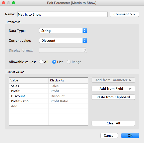

- You have four metrics you want a user to be able to choose from.
- Two of them are in number format (Sales & Profit) and two are in percentage format (Discount & Profit Ratio).
- You want the data, when displayed, to accurately reflect the formatting of the metric selected
- You only want to use a single metric.
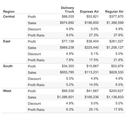
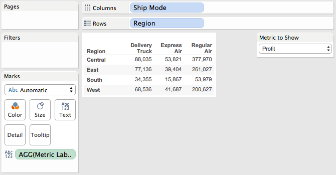
To start, consider the above scenario by starting with this table:
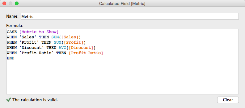
Next, create a calculated field to return the proper metric based on the selection in the parameter.
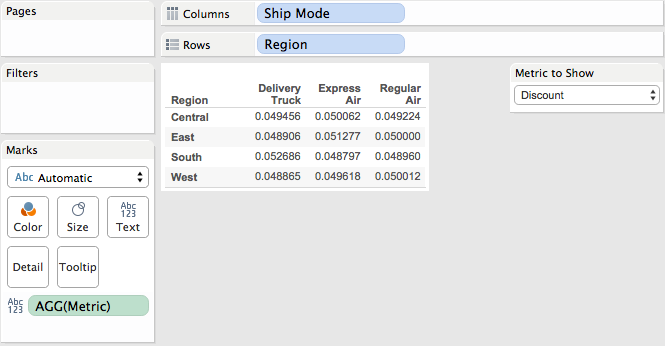
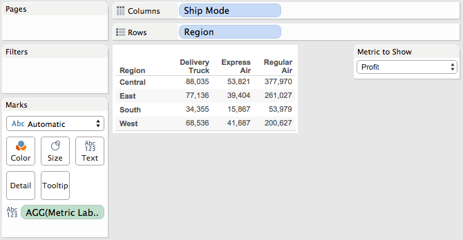
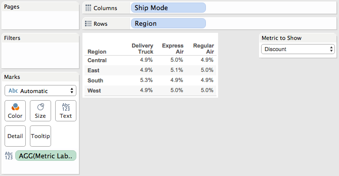
When this metric is placed in the viz and the selection is changed, the number formats aren't quite right. Sales and Profit look fine, but Discount and Profit Ratio, which are both percentages, aren't formatted properly.
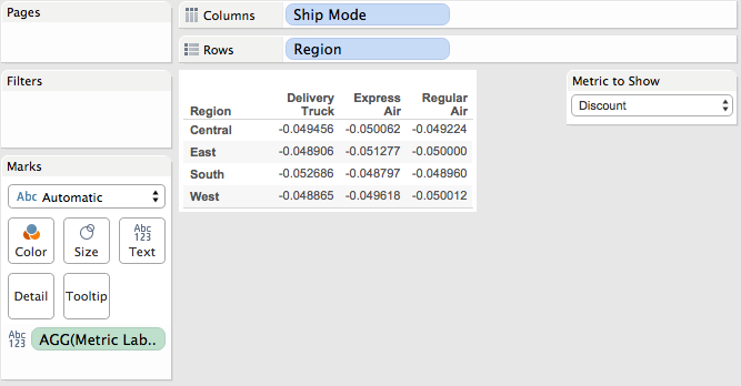
Here comes the trick. Create a slightly different calculated field to get the value of the metric selected:
Do you see what is different? There's a negative in front of Discount and Profit Ratio. Place this field in the view now instead, it's still not quite correct because Discount and Profit Ratio are now negative.
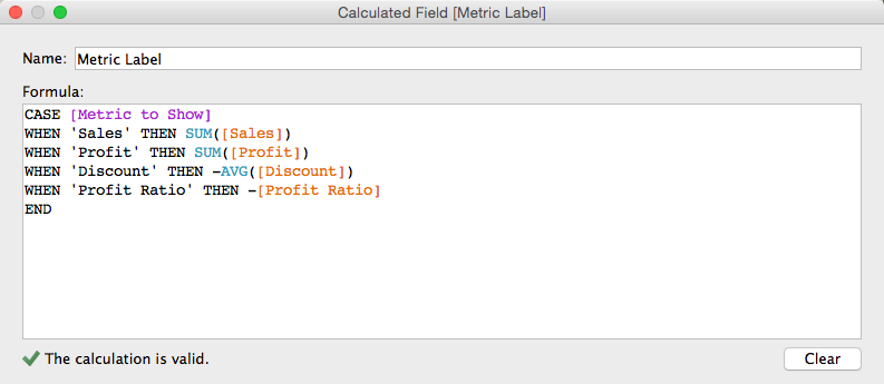
The trick is to change the default number format for this field. Right-click on the Metric Label field from the Measures window, choose Default Properties, then choose Number Format.
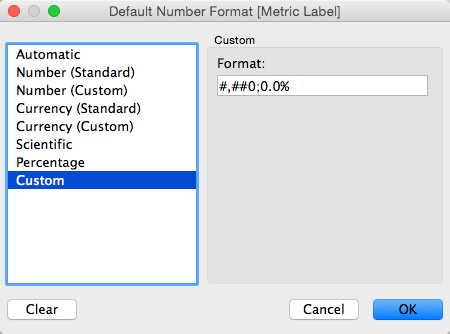
In the Default Number Format window, choose Custom and enter the string #,##0;0.0%.
Now the view will properly display numbers for Sales and Profit and percentages for Discount and Profit Ratio. This works because a custom number format allows you to specify a different format for negative numbers.
Here's an interactive version for you to play with:

NOTE: This formatting trick only works if all of the metrics will only return positive values. If Discount and Profit Ratio can return a negative value, then that will be converted to a number format (because negative x negative = positive). Similarly, if Sales can be negative (e.g., returns), then those would convert to a decimal format.
Here's an example of those scenarios:
Here's an example of those scenarios:


Subscribe to:
Post Comments
(
Atom
)


This comment has been removed by the author.
ReplyDeleteI saw this post today and I pushed it a little :)
ReplyDeletehttps://public.tableau.com/profile/publish/SayBiimi/Yazda#!/publish-confirm
Kar Oranı = Profit Ratio
Seçim=Select
Yazı Biçimi = number format
Because of you, I could think this :)
and thank you :)
DeleteFantastic tip, just what the doctor ordered, thanks!
ReplyDeleteHi Andy, another helpful article here. Thanks for contributing, and I do have a question here. I want to know how to achieve the layout exactly like the first pic showing on top. How to make a list of all these measure's together showing at same page instead of rotate them by the parameter selector? Is that coming from the parameter?
ReplyDeleteI would encourage you to recreate this step by step and also download the workbook. You'll see the answer along the way.
DeleteI got it, thanks.
DeleteWhat if you were filtering on Region already across multiple worksheets/dashboards and wanted to see the data filtered on a region instead?
ReplyDeleteHi Andy, it is really helpful. but i have an advanced question like the one you solved. I have two KPIs(buyer, revenue), and i want to show like"$ 100 M" or "$ 100 K" for revenue and "12 M" or "23 K" for buyer when i filter to corresponding KPI. Hope you have time to answer this. Thanks, Darren!
ReplyDeleteHow about this technique Darren? http://vizwiz.blogspot.com/2015/01/manyformats.html
Deleteawesome!!! thanks.
DeleteSuper helpful! Not the end of the world if the answer is "no", but is there anyway to get this to apply to the y-axis? Whenever I custom format the axis as #,##0;0.0% it reverses the y-axis for my percentages (so the lowest percentage is at the top)
ReplyDelete