January 13, 2015
Makeover Monday: Cristiano Ronaldo is the Most Popular Athlete in the World and it isn't Even Close
bar chart
,
basket
,
Cork Gaines
,
cricket
,
facebook
,
football
,
likes
,
Makeover Monday
,
soccer
,
sports
,
story points
,
tableau
,
tennis
,
track & field
No comments
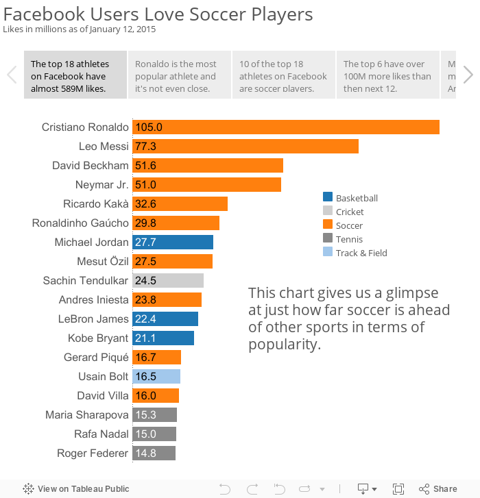
I had a choice to make this evening, catch up on my backlog of Makeover Monday posts or work on my performance review. Given that I enjoy writing about Tableau more than writing my performance review, allow me to present a second Makeover Monday of the day today. In this post, I take a look at this chart from Cork Gaines of Business Insider:

I've reviewed a lot of Cork's charts and this one makes many of the same mistakes as his past charts:
You can download the data here and the workbook here.
I've reviewed a lot of Cork's charts and this one makes many of the same mistakes as his past charts:
- It's incredibly annoying to have to turn my head sideways to read the chart.
- The chart is in ascending order, yet the story emphasizes the descending order.
- The colors aren't distinct enough from each other for me. For example, the colors for Track & Field and Cricket and too similar.
- The chart, on it's own, doesn't capture the entire story that's in the article.
With these problems in mind, I went to the Facebook page for each athlete and noted their likes. I then decided to use Tableau's Story Points feature. As Tableau says "Story Points gives the author the ability to present a narrative. As part of that narrative, the author can highlight certain insights and provide additional context."
You can download the data here and the workbook here.
Subscribe to:
Post Comments
(
Atom
)


No comments
Post a Comment