January 27, 2019
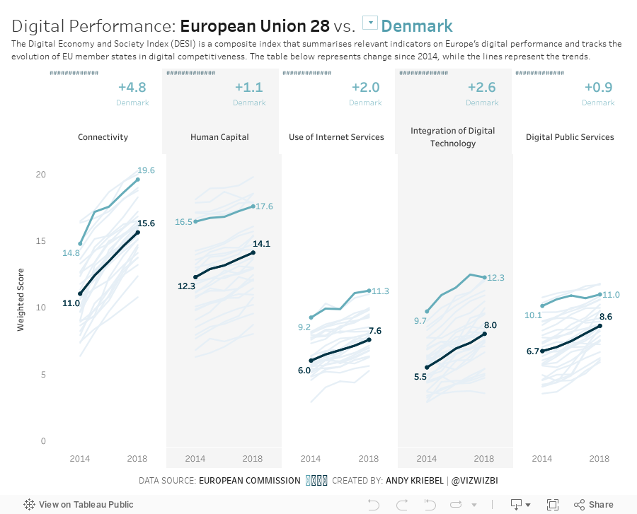
Makeover Monday: The Digital Economy and Society Index


What works well?
- The countries are sorted from best to worst.
- The scale and gridlines help guide the eye across the view.
- Using the country abbreviations so they are easier to read.
What could be improved?
- The title could include a subtitle to explain the DESI.
- Stacked bars are hard to compare across countries as they are influenced by the bars below them.
- The colors are too bright; everything is competing for attention.
- The legend does not need the numbers before each indicator.
What I did
- Added a subtitle to explain the DESI
- Split the indicators apart so they are easier to compare across countries
- Include a parameter to allow the user to select a country and have it highlighted
- Made the line representing the EU black so that it's in context for comparison
- Simplified the colors
- Added BANs to show the change vs. 2014 for the chosen country and for the EU (for context)
- Shaded every other column to guide the eye down the viz
Yes, I know this is the same highlighting technique I used in week 3. I used it again because it works.
Subscribe to:
Post Comments
(
Atom
)


No comments
Post a Comment