April 28, 2019
#MakeoverMonday: Space Station Spacewalks

 |
| Credit: NASA |
What works well?
- The title provides a nice summary of the data.
- The stacked bar chart makes is easy to compare the US and Russia within a single year.
- The colors are easy to distinguish from each other.
- Since there is no axis, labeling the bars makes sense.
What could be improved?
- The background image doesn't add any value and takes attention away from the chart.
- It took me a minute to figure out which color went with which country. That should be more obvious.
- Straighten the diagonal text for the years.
My Ideas
- Consider other chart types: area chart, stacked area chart, barbell chart, line chart.
- Consider other metrics like cumulative spacewalks or variance to some year.
- Check the two country flags for their official colors.
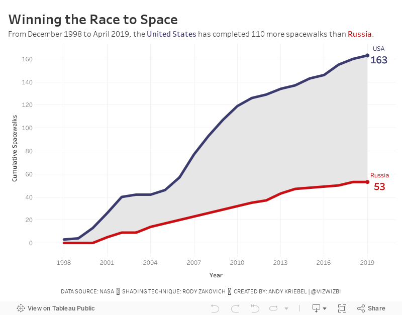
In the end I went with a cumulative line chart with shading between the lines. I did this with a polygon. See this blog post from Rody Zakovich to learn how to create it.
Subscribe to:
Post Comments
(
Atom
)


No comments
Post a Comment