December 23, 2013
Tableau Tip: Using actions to “reset” a chart to the most recent date
bar chart
,
index
,
interactive
,
line chart
,
max
,
rank
,
table calc
,
tableau
,
tips
,
tricks
6 comments
This is a guest post from Richie Fanti, who joined our team at Facebook at the beginning of December. This is a great example of the type of talent that we’re looking to bring onto our team. If you’re interested in joining our Analytics team as a Data Visualization Engineer, contact me via any of the links on the right side of this blog. Check out the job description here.
A great Tableau question came up at Facebook the other day. Often times our users are especially interested in the most recent daily data, but like to have the freedom to view historical details on demand as well. Trend lines are generally good at telling the historical story, but don’t always provide all of the details that users want. Wouldn’t it be cool to use a trend line to filter the specific components of a dashboard to any historical data point, but then be able to immediately revert to the most recent date on demand?
Suppose you have a simple dashboard composed of two sheets:
Now say we want the end user to select a mark on the trend line and have the bar chart update to a list of products within that respective product category and show sales for only that day. Tableau makes this very straightforward through the use of a filter action. However, what if the user unselects that mark on the trend line and we want the bar chart to revert back to only reflecting sales data for the most recent date of data? Without some extra manipulation and a couple table calculations, Tableau’s default behavior would be to clear all actions and show product sales for all dates in the partition, rather than only the most recent one. In other words, there are generally two things we want here:
Using the Superstore Sales Excel data, drag Sales to the Rows Shelf, Product Category to the Color Shelf, and right-click drag and drop Order Date to the Columns Shelf, choosing continuous days.
Also, we’ll need a date filter so that Tableau only shows the most recent two weeks in the view to simplify things. Drag Order Date to the Filters Shelf, choose “Individual dates,” go to the “Top” tab, and choose Top 14 by Minimum Order Date. This filters the partition to the most recent two weeks of data.
Let’s make this a global filter by right-clicking on the date field from the Filters Shelf and choose “Apply to Worksheets,” and “All Using this Data Source.” Now every viz we make using this data source will only reflect the most recent two weeks of data.
Cool, so far so good. Nothing tricky here. Now on to the bar chart. Drag Sales to the Columns Shelf, Product Name to the Rows Shelf, and sort descending by the sum of Sales. I like to add labels on the end of each bar by selecting the “Abc” icon on the toolbar as well. We can also add Product Category to the Color Shelf so that it matches the color scheme in trend line:
Note that view is showing the top products by sales within the last two weeks cumulatively. In order to satisfy #1 of our requirements, our users only want to only see data for the most recent day by default, rather than the most recent two weeks as a whole. This can be done in the dashboard by creating a filter action and selecting a mark on the trend line for the most recent day, but clearing the selection would just show cumulative two week sales again, which is not what we’re looking for. In order to get around this, we can add discrete days to the view, and use the INDEX() function to rank products within each discrete day of data. This will essentially allow Tableau to segment a list of top products within each day.
Now we need to use a table calculation to sort products within each day, rather than on the aggregate over all days. Create a calculated field, name it Product Rank, and use the index function in the Formula box.
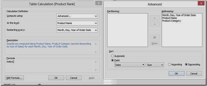
Right click on this newly created calculated field from the measures list in the data window and choose “Convert to Discrete.” Then, drag and drop this between the Order Date and Product Name on the Rows Shelf. Things will look somewhat funky, but we’ll fix this by right-clicking on the Product Rank field on the Rows Shelf and choosing “Edit Table Calculation…” Choose Compute using > Advanced. We want the table calculation to be addressed along Month, Day, Year of Order Date, Product Name, and Product Category in that order, and sorted descending by the sum of Sales. Then select At the level: > Product Name and Restarting Every: > Month, Day, Year of Order Date. Here’s the snapshot of the dialog boxes:
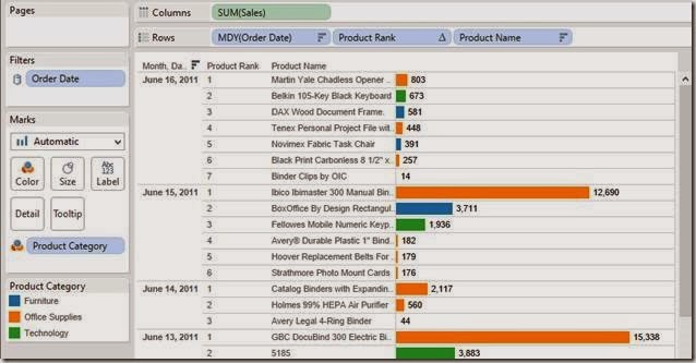
The sheet should now have products correctly sorted in descending order by the sum of sales within each discrete day.
Finally, we need to do this one more time for dates. However, we’ll use the index function differently this time. Since Order Date is already sorted, we don’t necessarily need the INDEX() function strictly to sort stuff. We can instead leverage the more formal ranking to dynamically filter only the top-ranked date. This is different from directly filtering the date field because that would not allow this sheet to interact with other sheets in the dashboard based on Order Date in the dynamic sense that we’re looking for. The INDEX() ranking allows Tableau to make two passes on the partition, therefore telling Tableau to aggregate sales for the past 14 days, but still giving us the ability to only view details for one date at a time dynamically and interactively.
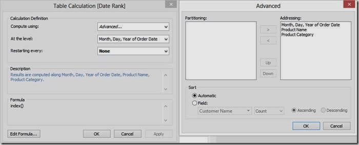
To create the second calculated field, right-click on Product Rank from the measures list and choose “Duplicate.” Rename it “Date Rank.” Drag this to the left of MDY (Order Date) on the Rows Shelf. We want to choose some advanced computation settings for this as well, so go to “Edit Table Calculation,” and edit the “Compute Using” settings so that the table calculation addresses Order Date, Product Name, and Product Category respectively. Then we want the results to be computed along Order Date so we can assign a rank to each discrete day in the view.
This should give us a list of products ranked in descending order by sales within each day, which is also assigned a rank in descending data source order.
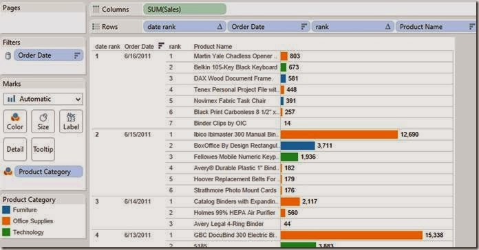
Now all we need to do is filter the viz so that it only shows the #1 ranked date, which is also the most recent day of data by default. Double-click on the Date Rank field on the Rows Shelf, and edit the selection so that only #1 is chosen. This is super important because, by filtering the Date Rank, we’ve just completed both #1 and #2 of our requirements for this dashboard. Not only is the most recent date now always going to be displayed by default, but we can also filter to other dates and clear the filter to revert back to the most recent.
All that’s needed now is some clean-up and actually building the dashboard. To hide some of the redundant stuff, right click on the Date Rank field on the Rows Shelf and uncheck Show Header, and do the same for the Product Rank field on the Rows Shelf as well. We’ll leave the date field included to ensure things are working correctly.
To make the dashboard, arrange the sheets to look something like this:
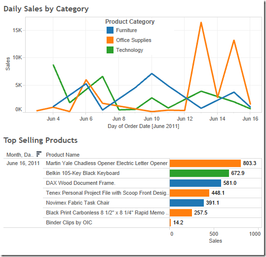
Finally, all we have to do is create the filter action and we’ll be good to go.
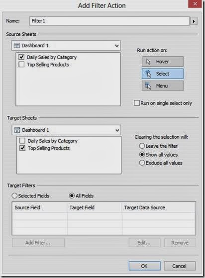
We now have a dashboard that only reflects product sales for the most recent day of data in the bar chart, and after interacting with the trend line, the bar chart will always default back to this day as well. This is a pretty cool functionality to have because often our users only care about what is happening today, but like to have the ability to look back at a snapshot in time to view more specific data that otherwise couldn’t be seen in the trend line.
Check it out. Play with it yourself below. Notice how the bar chart defaults to the last date. Click on a dot on the line chart, for example June 10th. Notice how the bar chart updates to reflect Jun 10th. Now deselect that point and the bar chart goes back to the latest date.
A great Tableau question came up at Facebook the other day. Often times our users are especially interested in the most recent daily data, but like to have the freedom to view historical details on demand as well. Trend lines are generally good at telling the historical story, but don’t always provide all of the details that users want. Wouldn’t it be cool to use a trend line to filter the specific components of a dashboard to any historical data point, but then be able to immediately revert to the most recent date on demand?
Suppose you have a simple dashboard composed of two sheets:
- A trend line that shows daily sales across product category
- A horizontal bar chart that shows the top selling products.
Now say we want the end user to select a mark on the trend line and have the bar chart update to a list of products within that respective product category and show sales for only that day. Tableau makes this very straightforward through the use of a filter action. However, what if the user unselects that mark on the trend line and we want the bar chart to revert back to only reflecting sales data for the most recent date of data? Without some extra manipulation and a couple table calculations, Tableau’s default behavior would be to clear all actions and show product sales for all dates in the partition, rather than only the most recent one. In other words, there are generally two things we want here:
- The bar chart should only reflect the most recent day of data by default (in this case June 16th).
- When a mark on the trend line is selected, the bar chart should dynamically filter to that respective day of data. However, if that selection is cleared, or if that mark on the trend line is unselected, we want the bar chart to revert back to only reflecting sales data for the most recent date (June 16th).
Using the Superstore Sales Excel data, drag Sales to the Rows Shelf, Product Category to the Color Shelf, and right-click drag and drop Order Date to the Columns Shelf, choosing continuous days.
Also, we’ll need a date filter so that Tableau only shows the most recent two weeks in the view to simplify things. Drag Order Date to the Filters Shelf, choose “Individual dates,” go to the “Top” tab, and choose Top 14 by Minimum Order Date. This filters the partition to the most recent two weeks of data.
Let’s make this a global filter by right-clicking on the date field from the Filters Shelf and choose “Apply to Worksheets,” and “All Using this Data Source.” Now every viz we make using this data source will only reflect the most recent two weeks of data.
Cool, so far so good. Nothing tricky here. Now on to the bar chart. Drag Sales to the Columns Shelf, Product Name to the Rows Shelf, and sort descending by the sum of Sales. I like to add labels on the end of each bar by selecting the “Abc” icon on the toolbar as well. We can also add Product Category to the Color Shelf so that it matches the color scheme in trend line:
Note that view is showing the top products by sales within the last two weeks cumulatively. In order to satisfy #1 of our requirements, our users only want to only see data for the most recent day by default, rather than the most recent two weeks as a whole. This can be done in the dashboard by creating a filter action and selecting a mark on the trend line for the most recent day, but clearing the selection would just show cumulative two week sales again, which is not what we’re looking for. In order to get around this, we can add discrete days to the view, and use the INDEX() function to rank products within each discrete day of data. This will essentially allow Tableau to segment a list of top products within each day.
NOTE: Since this is being done in version 8.0.x, I’m using the INDEX() function to get what we need here. Version 8.1 introduced some enhanced ranking functionality with the RANK() function, but the general framework behind this between v8.0 and v8.1 should be very similar.Right-click drag and drop Order Date to the left of Product Name on the Rows Shelf and choose the discrete MDY option. Right-click on this field and choose Sort, then choose Descending in data source order. This places the most recent day of data on the top of the list in the view. You should have something like this:
Now we need to use a table calculation to sort products within each day, rather than on the aggregate over all days. Create a calculated field, name it Product Rank, and use the index function in the Formula box.
Right click on this newly created calculated field from the measures list in the data window and choose “Convert to Discrete.” Then, drag and drop this between the Order Date and Product Name on the Rows Shelf. Things will look somewhat funky, but we’ll fix this by right-clicking on the Product Rank field on the Rows Shelf and choosing “Edit Table Calculation…” Choose Compute using > Advanced. We want the table calculation to be addressed along Month, Day, Year of Order Date, Product Name, and Product Category in that order, and sorted descending by the sum of Sales. Then select At the level: > Product Name and Restarting Every: > Month, Day, Year of Order Date. Here’s the snapshot of the dialog boxes:

The sheet should now have products correctly sorted in descending order by the sum of sales within each discrete day.

Finally, we need to do this one more time for dates. However, we’ll use the index function differently this time. Since Order Date is already sorted, we don’t necessarily need the INDEX() function strictly to sort stuff. We can instead leverage the more formal ranking to dynamically filter only the top-ranked date. This is different from directly filtering the date field because that would not allow this sheet to interact with other sheets in the dashboard based on Order Date in the dynamic sense that we’re looking for. The INDEX() ranking allows Tableau to make two passes on the partition, therefore telling Tableau to aggregate sales for the past 14 days, but still giving us the ability to only view details for one date at a time dynamically and interactively.
To create the second calculated field, right-click on Product Rank from the measures list and choose “Duplicate.” Rename it “Date Rank.” Drag this to the left of MDY (Order Date) on the Rows Shelf. We want to choose some advanced computation settings for this as well, so go to “Edit Table Calculation,” and edit the “Compute Using” settings so that the table calculation addresses Order Date, Product Name, and Product Category respectively. Then we want the results to be computed along Order Date so we can assign a rank to each discrete day in the view.

This should give us a list of products ranked in descending order by sales within each day, which is also assigned a rank in descending data source order.

Now all we need to do is filter the viz so that it only shows the #1 ranked date, which is also the most recent day of data by default. Double-click on the Date Rank field on the Rows Shelf, and edit the selection so that only #1 is chosen. This is super important because, by filtering the Date Rank, we’ve just completed both #1 and #2 of our requirements for this dashboard. Not only is the most recent date now always going to be displayed by default, but we can also filter to other dates and clear the filter to revert back to the most recent.
All that’s needed now is some clean-up and actually building the dashboard. To hide some of the redundant stuff, right click on the Date Rank field on the Rows Shelf and uncheck Show Header, and do the same for the Product Rank field on the Rows Shelf as well. We’ll leave the date field included to ensure things are working correctly.
To make the dashboard, arrange the sheets to look something like this:

Finally, all we have to do is create the filter action and we’ll be good to go.

We now have a dashboard that only reflects product sales for the most recent day of data in the bar chart, and after interacting with the trend line, the bar chart will always default back to this day as well. This is a pretty cool functionality to have because often our users only care about what is happening today, but like to have the ability to look back at a snapshot in time to view more specific data that otherwise couldn’t be seen in the trend line.
Check it out. Play with it yourself below. Notice how the bar chart defaults to the last date. Click on a dot on the line chart, for example June 10th. Notice how the bar chart updates to reflect Jun 10th. Now deselect that point and the bar chart goes back to the latest date.
Subscribe to:
Post Comments
(
Atom
)


Great work! The only issue is when someone selects multiple days, they will only see the most recent day of the selected marks. Another option is something like: http://public.tableausoftware.com/views/recentdatedashjmedit/CanSelectMultiple that takes advantage of the Filter Action options, either 'Show all values' or 'Exclude all values', and having one action's source and target fields be a value that does not match. Sometimes Conditional filters can have better performance than table calculation filters (I saw you already had one, so a duplicate of the field enables another, or it does not need to global and each sheet can have their own). Also , I used a combined field instead of a table calculation to sort, this leaves the in-axis sort button enabled.
ReplyDelete(side note: you will need to disable OpenGL if the view goes black when interacting with workbook in Tableau Desktop, see http://kb.tableausoftware.com/articles/Issue/dashboard-view-appears-black )
Joe - can you explain the change(s) you made? I see the results, but cannot duplicate them. Thanks.....
DeleteI would be interested in more details on the thought process behind this, as well. I've not seen this source/target field not matching technique before, and am not sure I understand what is happening in this example. If you have the time to write up a description, it would be greatly appreciated -- are there specific scenarios where you will use this technique?
DeleteThanks Joe
Thanks for the comments! I guess we lucked out in this case because the people using the dashboard only wanted to see one specific day at a time, rather than multiple. Assuming the end user only wants to see one, which method do you think would have the best performance?
ReplyDeleteI didn’t think of using an additional conditional filter to get the max date. Makes sense that this should be faster. Using a combined field to sort seems useful as well, especially if there is more than one column with measures to sort on (for example people could choose to sort on profit or sales).
On another note, I’m finding the method of using layout containers and filter actions with unmatched source and target fields to be very useful in multiple cases. If only there was an option to place floating sheets on top of each other with use of transparency instead of “shrinking” sheets with no data. Unfortunately those thin blank spaces between sheets become apparent when there are a bunch of sheets in the dashboard.
Can you please provide a little explanation on how the dashboard is able to show different dates for the bar graph even though there is a filter set to only show the "Date Rank" #1. I am trying to reproduce this technique with my own data and each time there seems to be conflict between the two filters filters (Date Rank filter and action filter). I have my date rank filter on, showing only the most recent date, but then on the dashboard whenever I click another date (not the most recent) the graph comes back blank. I am assuming this is because of the date rank filter on the sheet.
ReplyDeleteAny information would help.
I'd suggest you download the workbook and see how it was done. That'll be much easier than me trying to explain it all in a comment.
Delete