March 19, 2025
How to Analyze Customer Retention with a Jump Plot
arc
,
customer retention
,
data analysis
,
data visualization
,
how to
,
jump plot
,
relationship
,
tableau
No comments

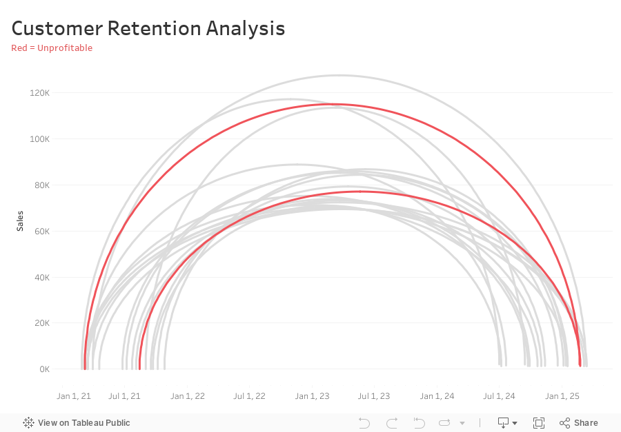
Want to analyze customer retention trends in a more insightful way?
In this tutorial, I’ll show you how to create a Jump Plot in Tableau, a powerful visualization that helps track customer movement over time.
You’ll Learn:
✅ What a Jump Plot is and how it works
✅ How to structure your data for this visualization
✅ Step-by-step guide to building a Jump Plot in Tableau
✅ Key calculations to track customer retention effectively
The data sets, calculations, & steps are below the viz.
Create a free account to access the data:
📊 Download the sales dataset here
📊 Download the jump plot dataset here
Calculations you need:
-
Connect sales data source to 180 points and relate “1” to “1”
-
Compute Min Date by customer
{ FIXED [Customer Name] : MIN([Purchase Date]) } -
Compute the Max Date by Customer
{ FIXED [Customer Name] : MAX([Purchase Date]) } -
Filter customers that made more than one order (Max Date > Min Date)
[Max Date]>[Min Date] -
Create Customer Length calc
DATEDIFF('day',[Min Date],[Max Date]) -
Create Columns calc (continuous dimension)
DATE( ((COS([Point] * PI() / 180)) + 1 ) * (FLOAT([Max Date])-FLOAT([Min Date])) / 2 + FLOAT([Min Date]) ) -
Create Rows calc (continuous dimension)
SIN((MIN([Point])) * PI() / 180) * SUM([Sales]) -
Add Columns and Rows to viz
-
Add Customer to Detail
-
Add Path to Path
-
Create Profitable calc and add to Color
{ FIXED [Customer Name] : SUM([Profit])}>0
Subscribe to:
Comments
(
Atom
)


