October 12, 2012
Stacked area chart vs. Line chart – The great debate
Let’s start with how area charts and line charts are typically used:
Area chart - Area charts are used to represent cumulated totals using numbers or percentages (stacked area charts in this case) over time.
Line chart - A line chart is often used to visualize a trend in data over intervals of time – a time series – thus the line is often drawn chronologically.
* Source: Wikipedia
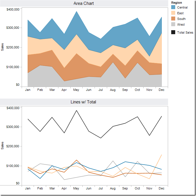
After reading these, one might suggest that an area chart provides the best of both worlds. Consider this area chart:
First impressions are often something like: “This is perfect! It shows me both the trends and the contribution.” However, it doesn’t show the trends as well as one might suspect. Why?
- Our eyes tend to focus on the tops of each line, leading to misinterpreting the patterns.
- It’s nearly impossible for us to translate the width of each color (i.e., the actual value) into an accurate trend. This is because the pattern of each color is influenced by the colors below it.
The only values that can be effectively interpreted are the West (gray area) and the total (top of the blue line).
Try this exercise.
Looking at the East and without scrolling down in this blog post, take one minute (using a timer) and try to draw the trend for the East only. In other words, if the chart was only the East, what would the pattern look like? Give it a shot, it’ll prove a point.
Here’s what the East looks like:
If you were able to draw this accurately in under a minute, then you’re likely some incredible genius, and good for you.
In every data visualization class I teach I use this exercise. I have yet to see anyone get close.
So that brings us to another question. What’s the best way to display the pattern for each region AND show the total. I recommend this:
Now you get the best of both worlds:
- You can see the trends for each region.
- You can see the total.
I accomplished this in Tableau with one table calc - TOTAL(SUM([Sales])) – and created a dual-axis chart by placing Total Sales on the secondary axis and synchronizing them. Download the Tableau workbook here.
I can’t recommend enough the exercise I outlined above. Sometimes asking the person you’re working with to draw the second area will prove your point for you.
Hopefully this will give you some ammunition next time you need to argue against stacked area charts.
P.S. If you’re curious to see the two charts together, here you go. Very different stories, wouldn’t you say?


Another alternative to using the table calc, is to take advantage of Multiple Mark Types, and have a different level of detail for each Marks card, removing the Region pill from the Total. see http://public.tableausoftware.com/views/AreaChartvsLineChart/Multimarktype for an example.
ReplyDeleteAlso in that workbook are two other added sheets that add to this discussion of Line v.s. Area. When looking at a percent of total.
Some stacked areas that I like are a Horizon chart, http://eagereyes.org/blog/2012/embracing-uncertainty-two-line-charts