January 26, 2015
Makeover Monday: Facebook's Global Economic Impact
3D
,
bar chart
,
Deloitte
,
donut chart
,
facebook
,
interactive
,
Makeover Monday
,
pie chart
,
tableau
1 comment
Last week on Facebook, I saw a link to this report by Deloitte. From what I can gather, Facebook commissioned Deloitte to estimate Facebook's impact on the economy. Read the report for more details.
In the report, the first graphic that Deloitte shows was this donut chart that explodes into three slanted pie charts:

Some of the most striking problems:
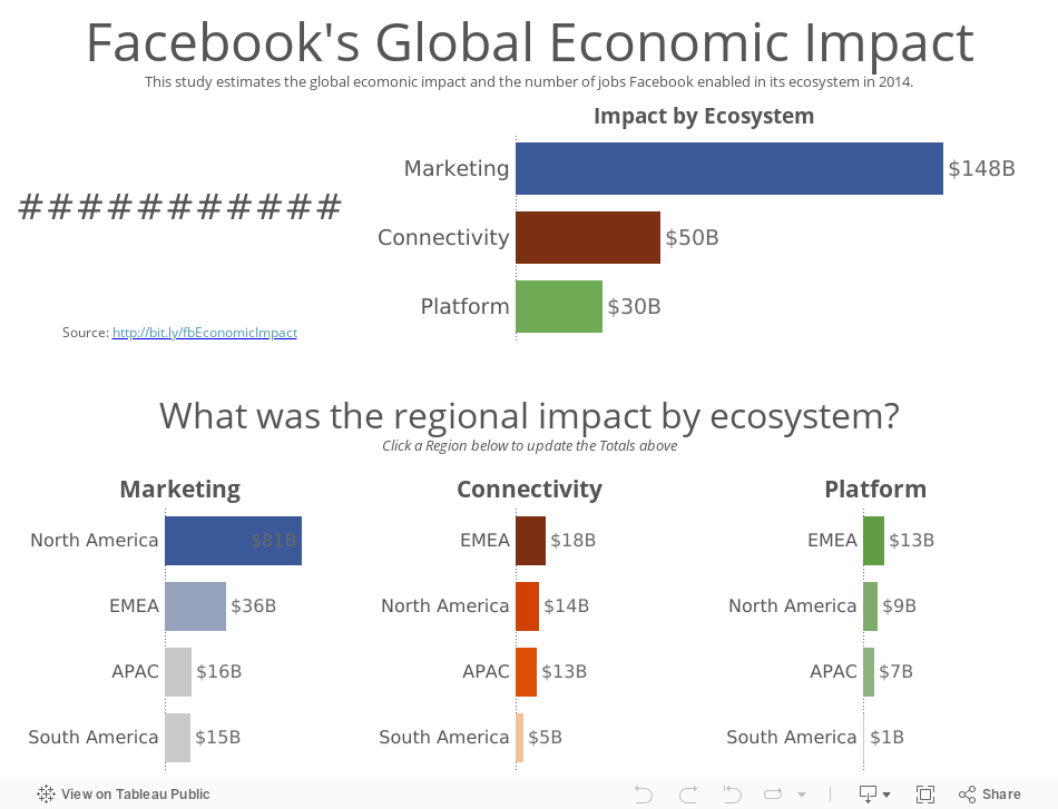
In this version, I attempted to address the concerns I outlined above by basically changing everything to bar charts and rearranging the view. Does this work better? Note that I added some interactivity as well.
In the report, the first graphic that Deloitte shows was this donut chart that explodes into three slanted pie charts:
Some of the most striking problems:
- Using a donut chart to represent parts-to-whole is a bad idea. Read this post by Steve Wexler for a good explanation on why you shouldn't use donut charts.
- There's an implicit hierarchy from the ecosystem to the breakdown of each ecosystem, yet this view goes in the opposite direction by having the regional breakdown above the totals.
- The pie charts, while not 3D are slanted, which distorts their proportions.
- Pie charts are not the best way to compare proportions.
- The title is super small. Looking at this as a stand-alone graphic, it's difficult to understand what the purpose of the graphic is in the first place.
I recreated the data in Excel (get it here) and created this dashboard in Tableau (get the workbook here).
In this version, I attempted to address the concerns I outlined above by basically changing everything to bar charts and rearranging the view. Does this work better? Note that I added some interactivity as well.
Subscribe to:
Post Comments
(
Atom
)


Hi Andy !! This is good in terms of visualization but in terms of color, it needs some rework. For example, when someone highlights North America, it needs to be same color across all 3 ecosystems.
ReplyDeleteOn a side note, you can also show a world map with a donut chart on top of each region ;-) But I know donut chart is not a good visualization best practice.