December 22, 2015
Tableau Tip Tuesday: How to Make Line Charts That Pop

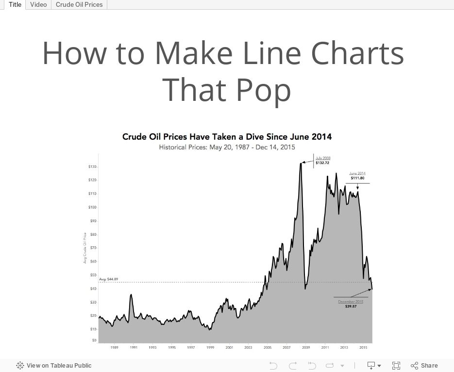
In this week's Tableau Tip Tuesday, I show you how I created the line chart that I used in my Makeover Monday. I like combining area charts and line charts. To me, they are more aesthetically pleasing, make the line more impactful, and bring out the patterns in the data better. But use them with caution as well. If you're going to include the area chart with your line chart, be sure to start the axis at zero. This is because visually the reader will interpret the entire area for comparison; if you don't include the entire area (i.e., not starting at zero), then you could mislead your readers.
Subscribe to:
Post Comments
(
Atom
)


Why the caution? Whats the down side?
ReplyDeleteThe caution goes with using an area chart. I've updated the post to include:
Delete"If you're going to include the area chart with your line chart, be sure to start the axis at zero. This is because visually the reader will interpret the entire area for comparison; if you don't include the entire area (i.e., not starting at zero), then you could mislead your readers."