January 6, 2019
Makeover Monday: How Has Press Freedom Changed Around the World?
freedom
,
freedom house
,
liberty
,
Makeover Monday
,
press
,
rating
,
score
No comments

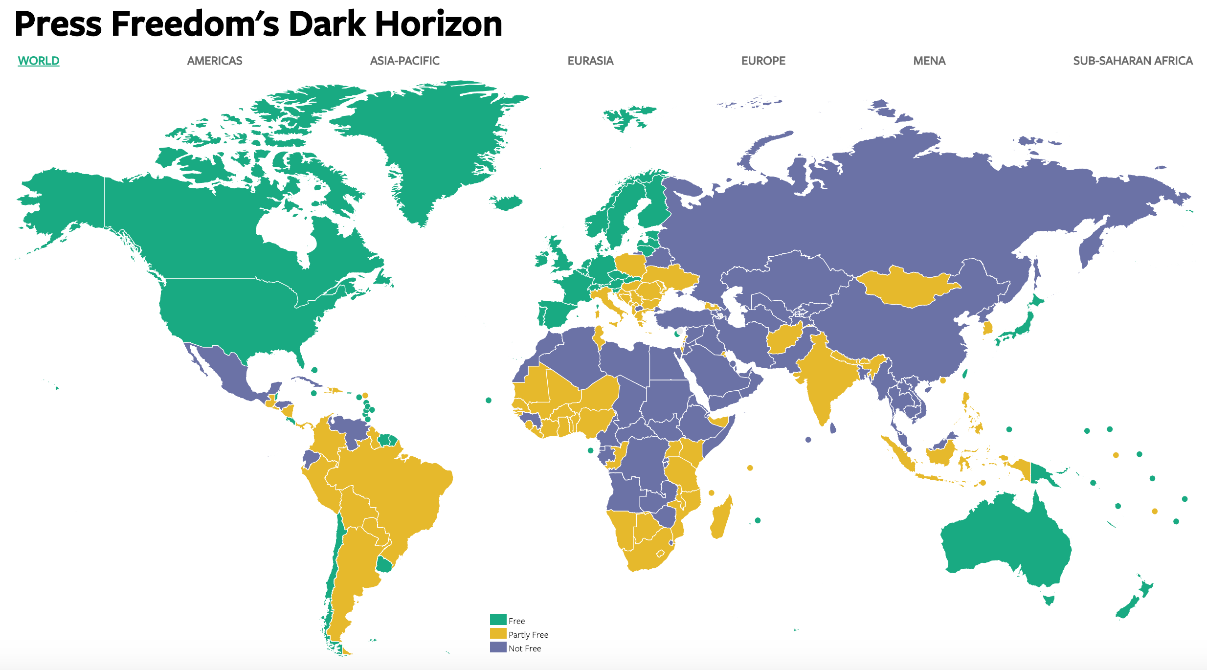
What works well?
- The colors contrast well and represent the values well (i.e., green = good, etc.).
- The map zooms in nicely as you select a region across the top.
- Good tooltips
- The white borders around each country make them easy to distinguish.
- Using dots to represent the small islands.
What could be improved?
- Without using the zoom feature, small countries are very hard to see.
- The title doesn't really tell me what the data map is about.
- You can't see trends over time. In other words, you don't know if the press are getting more or less free.
- There are no definitions for what the scores mean, unless you hover over a country.
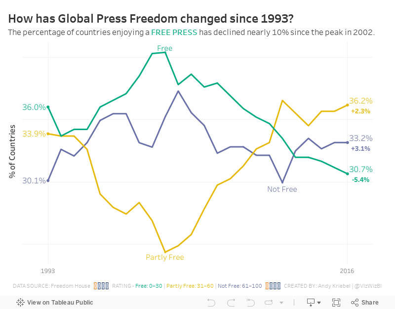
What I did
- I started by building a trellis chart that showed every country and its score over time. It was so messy and crowded so I scrapped it.
- I wanted to see the overall trends, so I focused on the percentage of countries within each year that fall into each status.
- I used the same color palette.
- I wanted to show the change vs. 1993, so I included that as text on the end of each line.
I found this to be a particularly interesting, and a bit alarming data set. According to this data, the Press are becoming less free. That's not good for democracy.
Subscribe to:
Post Comments
(
Atom
)


No comments
Post a Comment