April 22, 2019
#MakeoverMonday: Which NBA arena makes Stephen Curry's favorite popcorn?
basketball
,
food
,
Golden State Warriors
,
Makeover Monday
,
NBA
,
new york times
,
popcorn
,
Stephen Curry
No comments

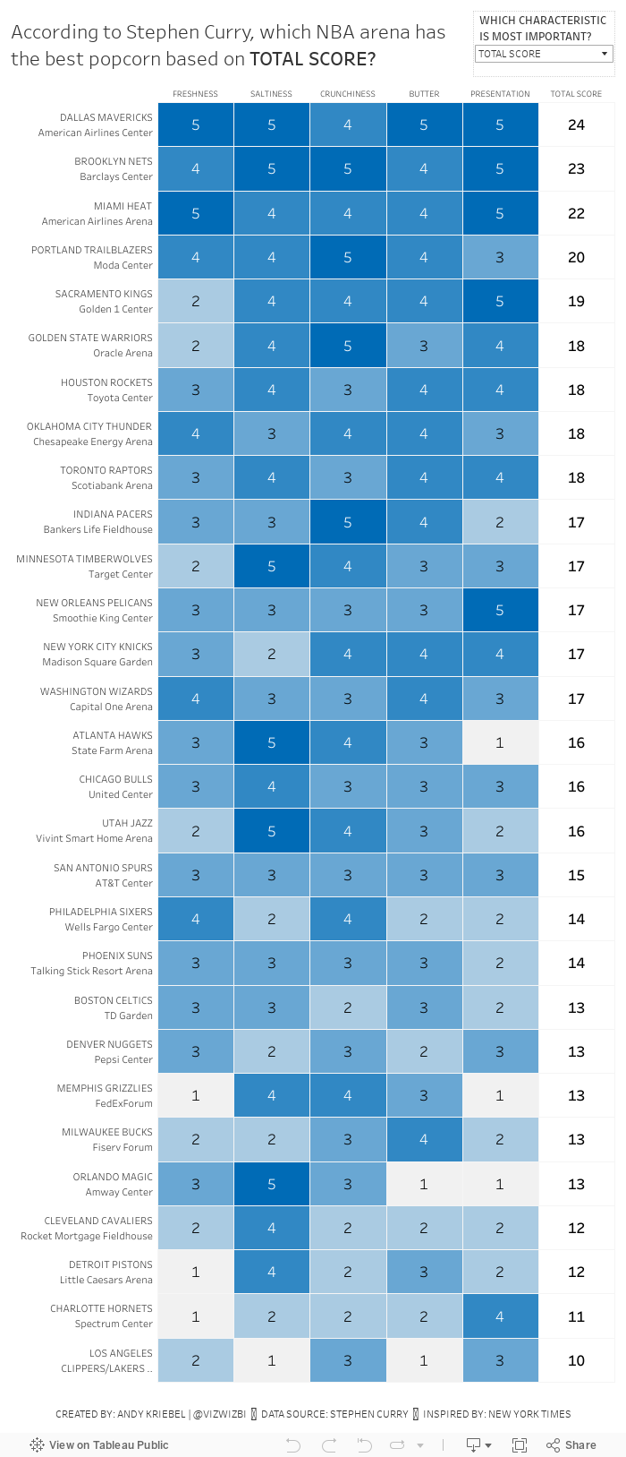
In the NYT article, they included a simple heatmap:

What works well?
- A heatmap is a good chart choice. Because the highest rating is darkest, those pop out more.
- Sorting the teams/arenas by the total score.
- Including borders around each cell helps separate them.
- Have both the team and arena together in a single cell but in multiple rows.
- Including the rating for each field.
- I love the data source!!
What could be improved?
- Needs a better title
- The diagonal rotation of the text makes the categories harder to read than necessary.
What I did
- I really like the original, so I also created a heatmap.
- I change the colors to use the blue from the Golden State Warriors brand colors.
- I made the category headers horizontal.
- I created a calculation to include the team and arena in the same field, but on multiple rows.
- I used viz in tooltip to shows the rating across all categories for each team.
- I included an option to allow the reader to sort by their most important factor.
Subscribe to:
Post Comments
(
Atom
)


No comments
Post a Comment