February 26, 2020
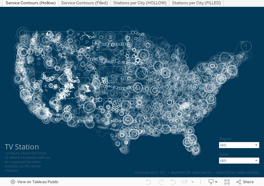
Visualizing the Geography of TV Stations
contour
,
Erin Davis
,
FCC
,
frequency
,
geography
,
map
,
parameter
,
region
,
signal
,
TV
,
United States
,
USA
No comments

The piece I wanted to replicate in Tableau is based on her beautiful work Visualizing the Geography of FM Radio. Since she had already done this for radio, I thought I'd try to replicate her work, but with TV stations, that is, the strength and coverage that the broadcast signals from TV stations transmit.
First, I had to prep the data. Fortunately the raw data was easily accessible on the FCC website as are explanations of the fields and how to use them. The FCC also have information about which States fall into which FCC regions. I manually grouped the States into their regions in Tableau (it would have needed to be manually created data anyway).
From there, it was some data prep to get the signal boundaries for each state, ensure they are in the correct State (e.g., some stations that were listed in California actually plotted in other States), then export as a TDE (Hyper files don't work well with polygons).
Here's the Alteryx workflow:

For Tableau, I created a custom color palette based on the color legend on Erin's vizzes, replicated her maps as close as possible, and that's it!
Enjoy!
Subscribe to:
Post Comments
(
Atom
)


No comments
Post a Comment