September 3, 2010
Tableau Tip: Creating a Waterfall Gantt Chart
eagereyes
,
gantt
,
presidentbush
,
provotis
,
tableau
,
tableau public
,
waterfall
6 comments
I keep up with the website eagereyes regularly and recently they ran a three-part series titled "A Protovis Primer" in which they introduced the tool Protovis. Protovis is an open-source tool that allows you to create data visualizations. Part 3 of the series was dedicated to instructions for creating a waterfall chart. If you take a quick look at the tutorial (well, there is no way to read it quickly), you will see that the method they have for creating a simple waterfall chart is in fact quite complicated and requires a lot of coding.
There's a much simpler way to do it...use Tableau. Here's the step by step way to
Step 1 - Add Inauguration to the column shelf and # and President to the row shelf. You need to have the # field so that the Presidents are listed in order from Washington to Obama.

Step 2 - Right-click on the YEAR(Inauguration) field and choose "All Values". This is required otherwise the time scale will not allow you to connect the start and end dates.

Step 3 - Right-click on the # field and uncheck "Show Header". This will hide the # column, yet still use it for sorting purposes.

Step 4 - Create a calculated field named Length of Presidency and drop it on the Size shelf (this gives the bar its length)

Step 5 - Create three calculated fields (Life, Time in Office, Age @ Inauguration) and place them on the Level of Detail shelf.


The end result should be a
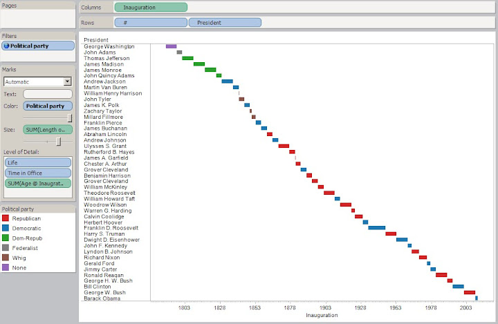
That's it! Very simple, especially after you do it a few times.
Going a step farther, I created a "timeline" that highlights the times each political party was in office. Here are all of the settings:
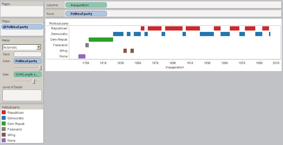
I put it all together in a dashboard. I made the Political Party field a global filter and highlighting is enabled when you click on the color of Political Party on the right. Finally, I published the workbook to Tableau Public.

Give it a shot. Download the Tableau Packaged Workbook.
Subscribe to:
Post Comments
(
Atom
)


I would consider this an example of a Gantt Chart, and not so much a waterfall chart. The top pane of Waterfall and Volume is what I would consider a waterfall chart.
ReplyDeleteFunny that you say that Joe. Originally my title was Gantt chart, not waterfall, but I changed it since the eagereyes blog was calling it a waterfall chart.
ReplyDeleteGantt chart sometimes looks like a waterfall when you break all the task together. Is there a way I can draw gantt charts not using microsoft tools? I want to find a good software for project management.
ReplyDeleteThere are lots of tools. You can use Excel, Tableau, Qlik, pencil and paper, etc.
DeleteHave you had any luck with hours, minutes, seconds in a Gantt chart? I can't make a job scheduling graph look anything like reality, 3 minute jobs span several days in my chart. Maybe Tableau 9 fixes some of these flaws?
ReplyDeleteG C, can you upload a workbook or data set that resembles yours so I can play with it?
ReplyDelete