May 20, 2019
#MakeoverMonday: Bear Attacks in North America
animals
,
bar chart
,
bear
,
bears
,
Canada
,
Makeover Monday
,
north america
,
unit chart
,
United States
,
Vox
No comments

Vox has an interesting article and has the visualization that we'll makeover this week.

What works well?
- The title summarizes the findings.
- The sub-title provides context.
- Including the source and author's name
- Using a bar chart
- Including the numbers in the bars
- Including the gridlines to make the bars easier to compare
- Good use of color
What could be improved?
- The bear icons should be removed.
What I did
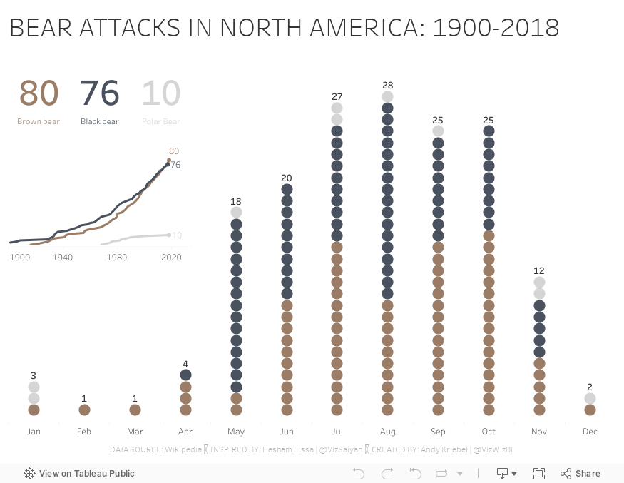
I really liked Hesham Eissa's viz this week, so I used that as inspiration for mine.
- His unit chart points downward, but I wanted mine to point upward.
- I like his BANs, so I included some of my own, but different numbers.
- I included the total for each month as he did.
- Hesham's dot are colored by the location (US vs. other), while I colored mine by the type of bear.
- I included a line chart to show the cumulative attacks by type of bear since 1900.
Thanks for the inspiration Hesham!!
Subscribe to:
Post Comments
(
Atom
)


No comments
Post a Comment