Showing posts with label Vox. Show all posts
May 20, 2019
#MakeoverMonday: Bear Attacks in North America
animals
,
bar chart
,
bear
,
bears
,
Canada
,
Makeover Monday
,
north america
,
unit chart
,
United States
,
Vox
No comments

Vox has an interesting article and has the visualization that we'll makeover this week.

What works well?
- The title summarizes the findings.
- The sub-title provides context.
- Including the source and author's name
- Using a bar chart
- Including the numbers in the bars
- Including the gridlines to make the bars easier to compare
- Good use of color
What could be improved?
- The bear icons should be removed.
What I did
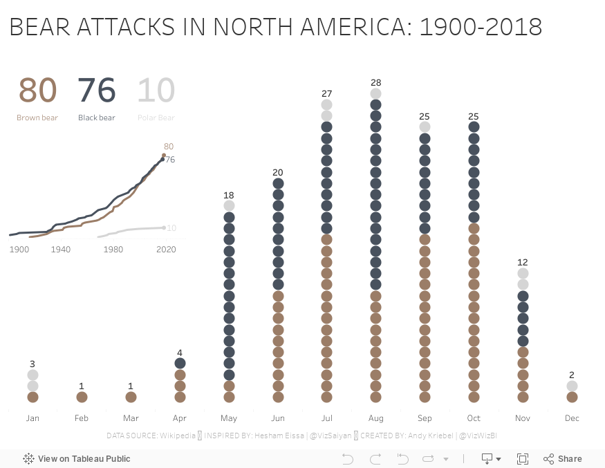
I really liked Hesham Eissa's viz this week, so I used that as inspiration for mine.
- His unit chart points downward, but I wanted mine to point upward.
- I like his BANs, so I included some of my own, but different numbers.
- I included the total for each month as he did.
- Hesham's dot are colored by the location (US vs. other), while I colored mine by the type of bear.
- I included a line chart to show the cumulative attacks by type of bear since 1900.
Thanks for the inspiration Hesham!!
March 19, 2017
Where is Planned Parenthood the only clinic that offers women the full range of contraceptive services?
I was looking through Twitter Friday and saw this tweet from Emily Crockett.
Emily was responding to the ignorance of HHS Secretary Tom Price. Here's the text from the Vox article:
Basically it says, get your act together and your facts straight Secretary Price. Do what's right for women in America!
Click on the image for the interactive version.

Dana Bash: What about 105 counties where PP is only option?— Emily Crockett (@emilycrockett) March 17, 2017
Tom Price: I'd like to see that list
Me: Here you go!https://t.co/7hDfI6CymF
Emily was responding to the ignorance of HHS Secretary Tom Price. Here's the text from the Vox article:
During a CNN Health Care Town Hall on Wednesday, co-host Dana Bash asked Health and Human Services Secretary Tom Price about what would happen to the women who rely on Planned Parenthood for health care if the organization were to be defunded.
Specifically, she asked about those who live in the 105 counties where Planned Parenthood is the only clinic that offers women the full range of contraceptive services.
“Well, I’d be interested in the list you have,” Price replied.Emily provides a simple list of the counties that are impacted. After a bit more reading, specifically on the National Campaign to Prevent Teen and Unplanned Pregnancy website, I was able to find the data behind the counties Emily listed. A few hours on a Friday evening later, and some great feedback from my colleagues, and I present to you this map of the counties. I think using visuals in this case tells a much more powerful story.
Basically it says, get your act together and your facts straight Secretary Price. Do what's right for women in America!
Click on the image for the interactive version.
Subscribe to:
Posts
(
Atom
)






