December 7, 2015
Makeover Monday: The Human Side of Executions in America
bar chart
,
cumulative
,
death
,
execution
,
line chart
,
map
,
USA
No comments

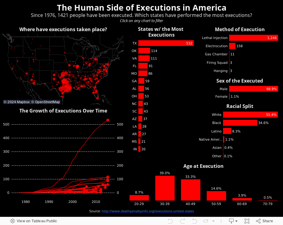
For this week's Makeover Monday, I take a look at this visualisation I saw on FlowingData.

What works well?
- Nice summary table
- Impactful
What can be improved?
- The chart needs a title.
- There are too many colours on the line chart to distinguish and unless you pay attention carefully, you might not notice that the legend is actually the text on the table.
- The scale of the line chart distorts the view and the non-linear scaling is not called out.
- The line chart should have about a 3x2 scale; this one is more like 2x3, making the lines too steep.
- For people not from the US, a map would be helpful.
- Why not include the data for all states? It only took me a few seconds to find it.
- My eyes are drawn to all of the text on the upper left first, not the story in the charts.
Given these issues, I've taken a much more detailed approach. I've fixed all of the issues I mentioned above, and I've also added much more detail and made the viz interactive.
Subscribe to:
Post Comments
(
Atom
)


No comments
Post a Comment