October 7, 2018
Makeover Monday: Five-year Cancer Survival Rates in America
America
,
big numbers
,
cancer
,
line chart
,
Makeover Monday
,
our world in data
,
rates
,
reference band
,
sparklines
,
survival
,
United States
,
USA
No comments

Here's the original viz:
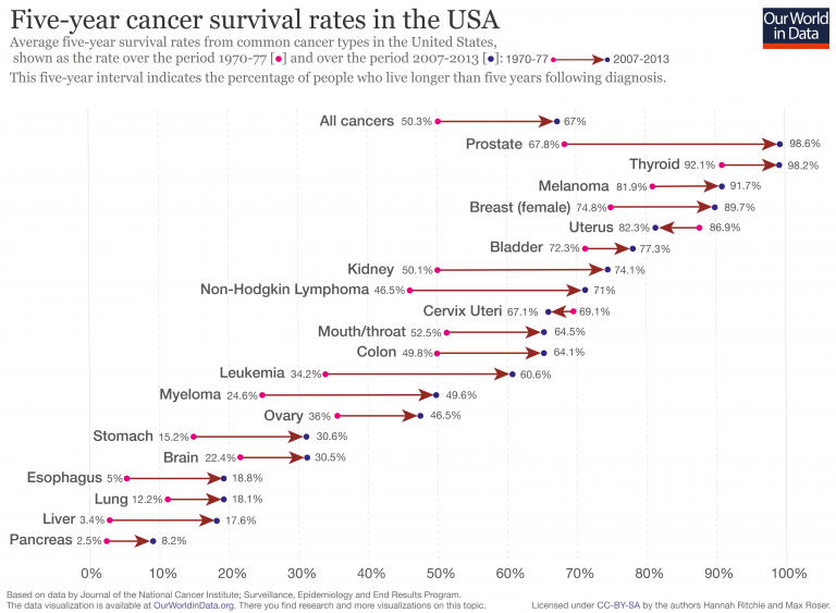
What works well?
- Simple title that explains what the viz is about
- Cancer types are sorted from highest to lowest based on the five-year survival rate
- "All cancers" is sorted at the top since it's the overall statistic
- Using arrows to indicate improving or declining
- Using different colored dots for each time period
- Including an explanation for how the data came about
What could be improved?
- The subtitle is long. I had to read it a couple times to understand it.
- The viz overall feels kind of busy.
- By using directional arrows, the change over time is lost. The change isn't linear, but the design could be interpreted that way.
- Color the arrows by increasing or decreasing. Uterus and Cervix Uteri cancer survival rates have decreased, but that could easily be missed.
What I did
- Incorporatde the change over time
- Used BANs for the first period and the last period measured and the difference
- Used a big dot to indicate a reduction in survival rate
- Used row banding to guide the eye from left to right (taking a lesson from last week's Workout Wednesday)
- Provided an option to filter by race and gender
- Used a set to split the view into the top 9 on the left and the rest on the right; my first version was one long viz, but I didn't like how I had to scroll.
- Used reference bands vertically and horizontally to give the labels space on the ends of the lines
Click on the image below for the interactive version.
Subscribe to:
Post Comments
(
Atom
)


No comments
Post a Comment