January 21, 2019
Makeover Monday: Electricity Use at 10 Downing Street
10 Downing Street
,
carbon footprint
,
energy
,
Makeover Monday
,
money
,
Prime Minister
,
UK
,
united kingdom
No comments

Here's the viz Eva chose:

What works well?
- Really nice BANs that also have context included. I give people feedback quite often that BANs can be great, but they're meaningless without context.
- Nice filter options with the buttons at the bottom
- The chart shows the peaks and troughs well.
- Using different colors for peak usage
- Data updates as you click on the BANs
What could be improved?
- Include a legend so you know what the colors signify
- A better x-axis is needed
- Remove the buttons that don't have any data, District Heat and Gas in this case
My Plan
- Hold off on working on my viz until we have our weekly Makeover Monday time at the Data School. I've written this section and the two above Sunday night.
- Explore the data with line charts to get a sense for the patterns in the data.
- Keep something similar to the BANs; consider different or additional context.
- Should the timeline show all of the data? Play about with different filter options.
- Consider a heatmap that shows usage by hour of the day compared to day of the week or perhaps month.
- Will reporting energy use, money, and carbon impact in the same dashboard be too crowded?
- Explore relationships between the metrics with scatterplots. Is a connected scatterplot an option?
- Would a mobile version be better so that people can look at it on the go?
- Is there any additional data?
What I Uncovered
- The data set only included 2017, so I downloaded back to 2008 as well. But data only existed back to 2013, so I had to deleted 2008-2012. Tableau Prep doesn't allow you to skip the first three rows, which is required for 2013-2016, so I used Alteryx instead and then unioned those years with 2017.
- Only data for electricity usage is consistent across the years; I was expecting to see money and carbon impact as well. I wonder why don't they include those as well. Anyway, this eliminates a scatter plot.
- Data was missing for December 2015, so I excluded that month from the data set.
- There were lots of zeros, so I removed those as well.
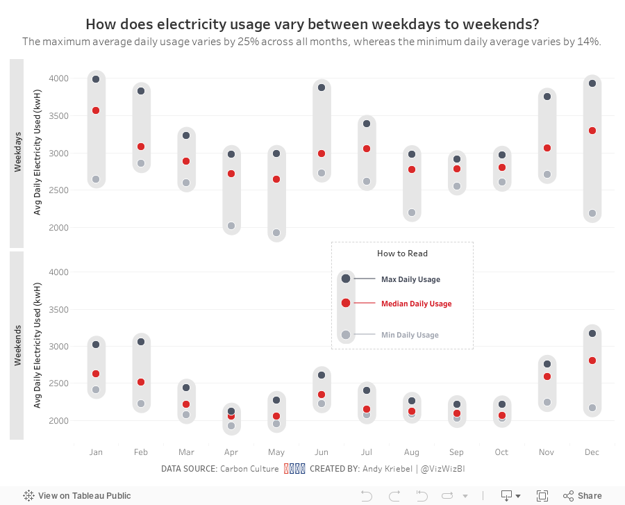
And here's my viz after working on it for 60 minutes at the Data School.
Subscribe to:
Post Comments
(
Atom
)


No comments
Post a Comment