May 6, 2019
#MakeoverMonday: Major League Baseball's Most Cost Effective Players
baseball
,
connected scatterplot
,
cost effective
,
database
,
lahman
,
Makeover Monday
,
MLB
,
OBP
,
on base percentage
,
quadrant chart
,
salary
,
scatterplot
No comments


What works well?
- The title and subtitle explain what the viz is about.
- Dividing the viz into two sections by using different background colors on the scatter plots
- Consistent scales for the salaries across the charts for each section
- Using gridlines to help the audience understand the approximate values of each point
- Only labeling the type of stat once by putting the label between the players and teams charts
What could be improved?
- There's no data source listed.
- I have no idea why these players or team are highlighted; an explanation is needed. At first, I thought it was highlighting the most effective player/team, but it's not (at least that's what I see).
- The logos are meaningless for people that aren't familiar with the teams.
- What does the big logo on the upper right represent? Is that the author?
- The data should be filtered to players that meet certain criteria, like at bats in a season. This would then filter out many players near zero.
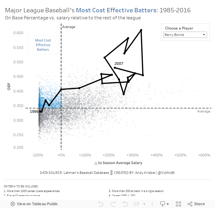
I liked the idea of using a scatter plot like the original, but I wanted to focus on a metric the better measures "effective". There are so many sophisticated metrics now in baseball. I didn't want to use any of those because they're hard for people to understand. I decided to use on base percentage which is the number of times a player reached base (H + BB + HBP) divided by at bats plus walks plus hit by pitch plus sacrifice flies (AB + BB + HBP + SF).
Why did I choose OBP? Ryan Kelley sums it up best in a post on Quora:
Outs are an extremely scarce resource in the economy of a baseball game, each team has 27 to use (in a 9-inning game) while trying to score as many runs as possible. Every time a batter makes an out therefore, the expected number of runs his team will produce will decrease (assume runs are also a limited resource for now).
A batter's job is to get on base--not make an out in other words. A batter fails to do his job when he makes an out, this failure percentage is 1 - OBP. The success percentage is OBP. If every batter had a perfect 100% OBP, their team would score an infinite amount of runs before every making an out.
Now, because you're talking about value specifically. OBP alone isn't effective in measuring value. You can make it a better indicator of value by giving it context. That context depends on what kind of value you're talking about.
You could tie OBP to a player's salary. This would give you an indicator of how value that batter was to his team in the context of a labor market. After all, baseball players are just employees of franchises in the end. Their jobs are to produce wins. A hitter's job is to produce wins via producing runs. Franchises make money by selling those wins to fans as entertainment.
Each team has a fixed amount of payroll to spend on wins, so the more payroll a batter's salary takes up, the less valuable he is to his team. A good way of illustrating a player's value would be OBP/$ of Salary.
Based on Ryan's explanation, I decided to use OBP as my proxy for batter effectiveness (y-axis). For the x-axis, I wanted to use salary for comparison. However, the data does not adjust salaries for inflation, so a salary in 1985 is not listed in 2016 value. Instead, I came up with a way to normalize the data across all of the seasons.
I created a calculation that compares a player's salary to that of the average salary of the entire league for each season. I made this a percent difference so that the data would then be normalized. Therefore, a player that was 10% above a 1985 salary would be comparable to players that was 10% above a 2016 salary.
Here are my calculations:
- Season average salary: { FIXED [Season] : AVG([Salary]) }
- △ to Season Average Salary: (AVG([Salary]) - SUM([Season avg Salary])) / SUM([Season avg Salary])
- First, I applied some filters to only include what I deemed "eligible" players. These are noted at the bottom of the viz.
- Now that I have the x-axis (salary variance from season average) and the y-axis (OBP), I created a scatter plot and added a point for each player for each season.
- I added reference lines for the average of each axis.
- The players on the upper left are the most cost efficient players. That led me to a quadrant chart, but I only wanted to highlight the most cost effective. I created a calculation to determine the points in that quadrant and place it on the color shelf.
- The problem now was that it was basically impossible to find a player in the viz. I thought about using a set action to drill in to a player, but that loses all of the context of the other players. Therefore, I create a parameter to allow the user to highlight a player and I show that players as a connected scatter plot.
SOME THINGS I FOUND
And here's my final product. I had never thought of combining a scatter plot and a connected scatter plot before. I'm quite pleased with how this turned out.
- Players tend to be more cost effective earlier in their careers. That makes sense since they are on rookie contracts for the first few years of the career.
- Once players sign their first big contract, they tend to either move to the upper right (high OBP, high relative salary) or the bottom right (low OBP, high relative salary).
- Some players can sustain that for the rest of of their careers, but that's rare. Typically it's the superstars that follow this pattern (like Barry Bonds or Chipper Jones).
- For many of the other players, as they approach the end of their career, they tend to move either to the lower right (high relative salary, low OBP) or the lower left (low relative salary, low OBP). Neither of these are particularly good for the team.
And here's my final product. I had never thought of combining a scatter plot and a connected scatter plot before. I'm quite pleased with how this turned out.
Subscribe to:
Post Comments
(
Atom
)


No comments
Post a Comment