July 29, 2019
#MakeoverMonday: STD Infection Rates in America 1996-2014
America
,
CDC
,
infection
,
Makeover Monday
,
sexually transmitted disease
,
std
,
tableau 6
,
United States
,
USA
No comments

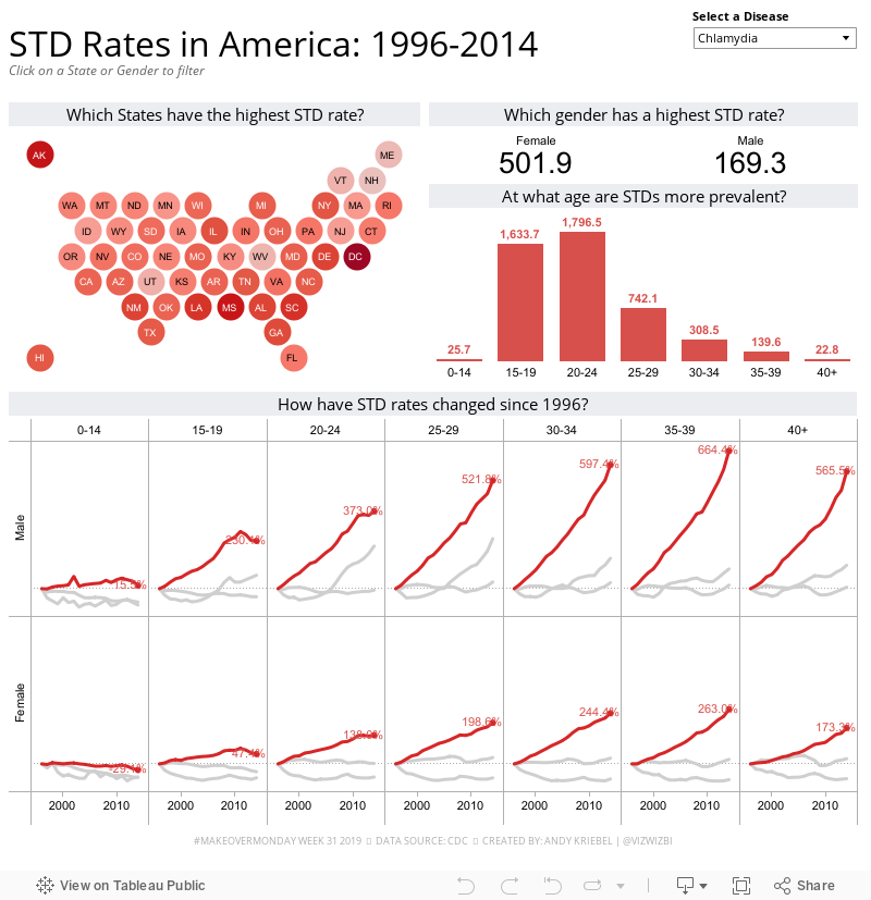
Here's the viz:

Eva had the idea this week to created a discussion on Twitter about what people thought could be improved. For me, it's been a fascinating discussion and it shows how much people participating in Makeover Monday have learned about data visualization. Follow the thread here.
WHAT WORKS WELL?
- Simple title that includes the time frame for context
- Using the subtitle as instruction
- Keep the filters grouped together on the right, out of the way
WHAT COULD BE IMPROVED?
- Lose the red/green color palette.
- A diverging color palette should only be used if there's a natural midpoint; there isn't one with this data
- There's double encoding on every chart.
- The State filter list it too big; granted though that there was no multi-select dropdown filter at the time.
- The map and the states bar chart are the same.
- The sparklines and the bar charts represent the same data.
- The reference lines aren't needed. What does an average infection rate really mean?
WHAT I DID
I decided to go back to Tableau 6 to see if I could create something decent. You can see the whole recording below. I took a lot of the feedback from Eva's thread and incorporated it into my viz. A few decision I made:
- Simplified the metrics
- Used a map that weights all states equally (like a hex map but circles)
- Used only a single color
- Used highlighting more effectively
- Created simple filter actions
- Used simple chart choices
So here's my Makeover Monday, built with Tableau 6.0:
Subscribe to:
Post Comments
(
Atom
)


No comments
Post a Comment