September 30, 2019
#MakeoverMonday: London's Aging Population
forecast
,
London
,
Makeover Monday
,
open data
,
population
,
projection
,
united kingdom
No comments

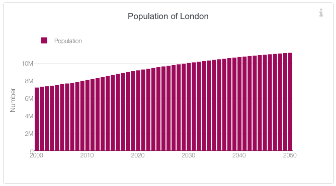 |
| SOURCE: London Datastore |
What works well?
- It's a simple bar chart, which is very easy to read.
- Uses a single color; we often see the bars double encoded with the same value as the length of the bar.
- The axis starts at zero.
- Simple, clear axis labels
What could be improved?
- I think a line chart would be even easier to read.
- The title says "Population of London" but it's really the projected population plus the past population; some clarification would be good.
- The legend isn't needed.
- The y-axis title could either be removed or changed. "Number" doesn't mean a whole lot.
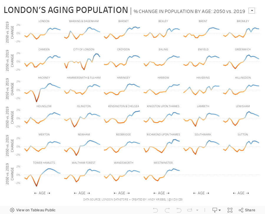
For my makeover, I was interested in comparing the distribution of the population by age for one year compared to the distribution of the population in 2050. For example, what was % of the population for 45 year olds for 2018 and 2050, then compare those two values. This then shows how the population distribution will change.
Subscribe to:
Post Comments
(
Atom
)


No comments
Post a Comment