November 18, 2019
#MakeoverMonday: Tween and Teen Smartphone Ownership
change
,
level of detail
,
LOD
,
Makeover Monday
,
mobile phones
,
smartphone
,
teens
,
trend
,
tweens
No comments

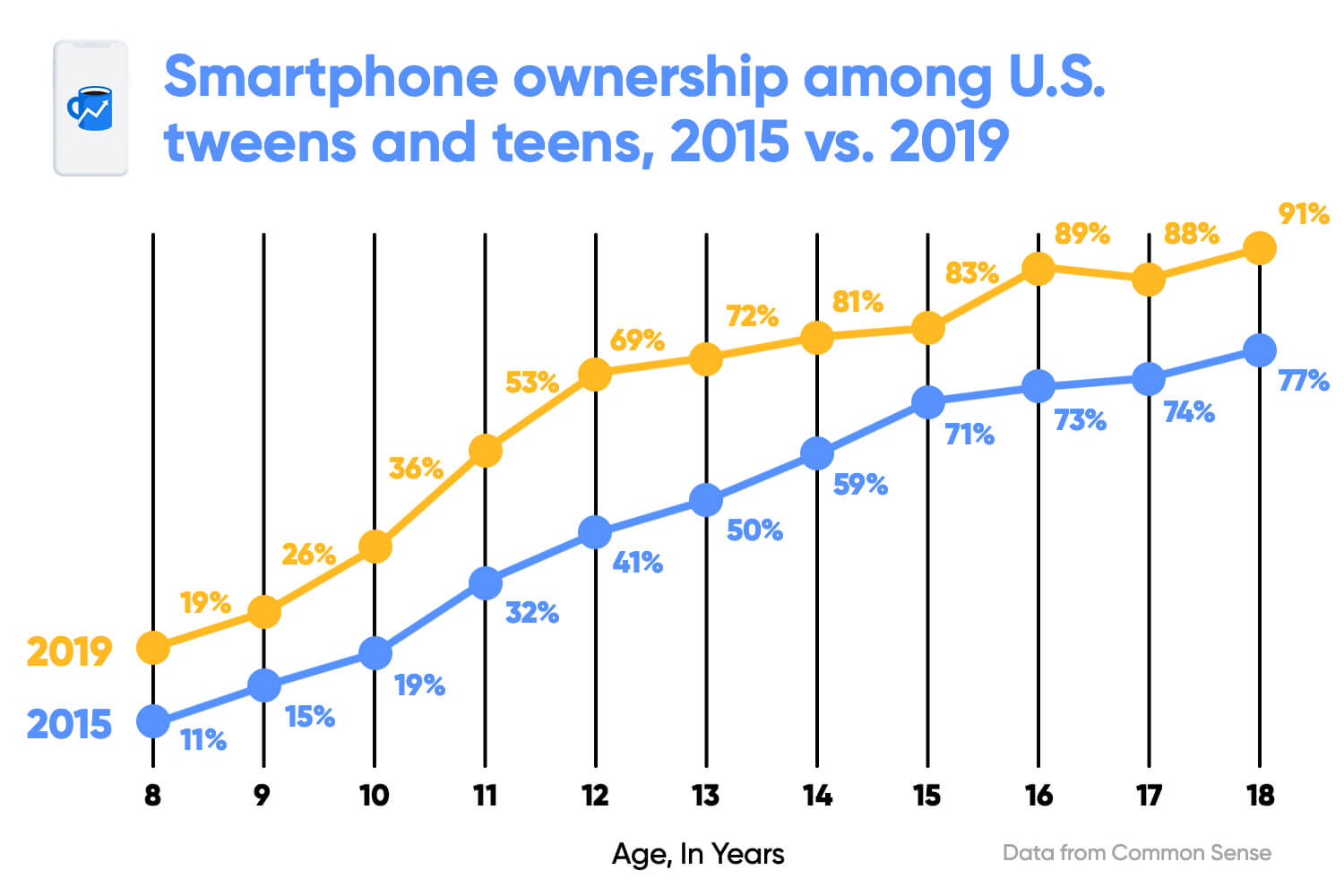 |
| SOURCE: Morning Brew |
What works well?
- Clear title
- X-axis is clearly labeled
- Including the data source
- Colors are easy to distinguish
- Vertical lines help draw the eye to compare the years within each age
- Including labels since the y-axis is hidden
What could be improved?
- The title could be less bold.
- The title uses the color for 2015, but it's not related to one year only.
- The dots are distracting since they are so large.
- The labels are helpful, but do they need to be so big?
- With the vertical lines connecting the dots within the year, and the line connecting the ages across the years, I'm not sure which is more important. Given the title, the focus seems like it should be on comparing years within an age.
- The vertical lines don't need to be so broad.
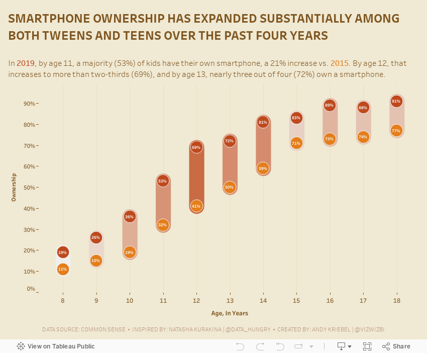
What I did
- Removed the lines to make the focus comparing the ownership within an age group
- Surrounded the dots with a band to ensure the user reads the data within each age group
- Colored the bands by the change to accentuate the ages that have changed the most
- Included the labels, but made them very small as to not distract from the analysis
- Created a mobile version for practice
Subscribe to:
Post Comments
(
Atom
)


No comments
Post a Comment