December 16, 2019
#MakeoverMonday: How much better is the Spurs defense than the rest of the NBA?
basketball
,
defense
,
fivethirtyeight
,
greg popovich
,
Makeover Monday
,
NBA
,
san antonio spurs
,
stats
,
tim duncan
No comments

 |
| Credit: FiveThirtyEight |
What works well?
- The title and subtitle give you an immediate sense of what the chart is about and the story it will tell.
- Coloring the bars above and below the league average different colors
- Using bars, so that you can compare the length of them instead of a line that would show trends.
- Really nice annotations
- Shading the background to draw attention to a set of seasons
- Minimal axis labels
- Clean design
What could be improved?
- Why does better go down? That's not very intuitive.
- The shading might give the impression that the coach ended where the shading ends, but Popovich is still the coach.
- It looks strange the 1980 and 2000 are offset, but 2020 isn't.
What I did
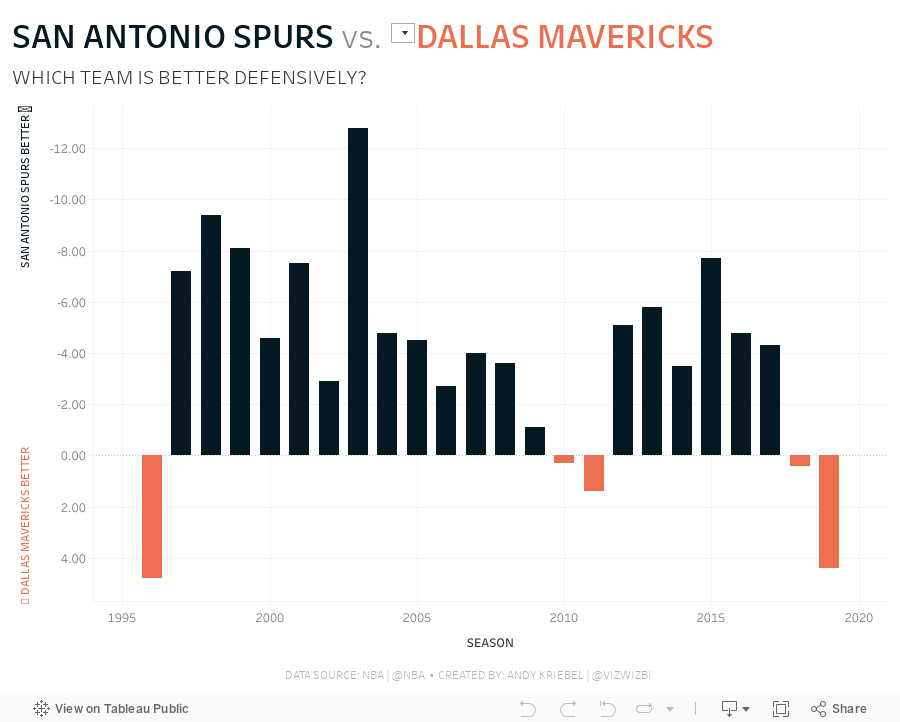
- Instead of comparing to the league average, I decided to compare the Spurs to the team of the user's choosing.
- Instead of using variance to the league average as the metric, I used defensive rating.
- I liked how the original had two colors for better or worse, so I followed that theme. My color for Spurs is always black since that's their team color.
- I included a note in the tooltip to clarify that a lower score is better.
- I wanted the Spurs going upwards if they are better, despite the axis being negative as it goes up.
Subscribe to:
Post Comments
(
Atom
)


No comments
Post a Comment