August 22, 2014
Spreading the Gospel of Data Viz & Tableau at Facebook: The VizWiz Tour
Andy Piper
,
ATUG
,
bar chart
,
Ben Sullins
,
BI
,
cincinnati
,
color
,
data viz
,
facebook
,
interactive
,
Jeffrey Schaffer
,
John Hoover
,
Jonathan Pickard
,
line chart
,
map
,
Matt Shoemaker
,
presentation
,
sdtug
,
tableau
,
training
2 comments
My first stop was back at my old stomping grounds at the Atlanta Tableau User Group, where Andy Piper and John Hoover of Norfolk Southern hosted over 100 people. A few days later I was preaching again to a group of about 50 at the San Diego Tableau User Group, where Matt Shoemaker of Interactions Marketing and Ben Sullins of Pluralsight hosted the event.
Tuesday marked the culmination of the mini-tour, with 2014 IronViz contestant Jeffrey Shaffer of Unifund and Jonathan Pickard, the leader of the Cincinnati Business Intelligence & Analytics group, hosting the event at the amazing Linder College of Business at the University of Cincinnati. They really have something special going on at UofC in the business analytics space. If you're looking for great analytical talent, they definitely need to be on your list of places to visit and connect with.
There were about 100 people in attendance, all armed with Tableau Public, data about airline delays, great questions and an incredible appetite to learn.

The format of my talks during this tour generally followed this three-hour agenda:
- Hour 1: Presentation – Building a data viz & Tableau culture; How we did it at Facebook & how you can do the same
- Hour 2: Tableau Training - Fundamentals for analyzing an unfamiliar data set
- Hour 3: Group exercise and viz presentations
One of the things I like to do when giving these talks is to ask the audience why they are there. This way, I can customize the talk along the way to make it more suitable for them and to ensure they get the most value out of it. The drawback of this approach is that the talk tends to go on longer than one hour, which was the case Tuesday.
To accommodate for my long-windedness, we decided as a group to skip the group activity and focus on the Tableau training. The fact that every person in the audience came prepared with Tableau installed was a HUGE help and a big time-saver. When I teach, my goal is to overwhelm the class. I have always felt that when learning Tableau, you should drink from the fire hose. I move very fast in the training, yet I don't leave anyone behind. The class will often feel that I'm moving way too quickly at the start, but I do that intentionally, so that they learn how easy it is to build in Tableau.
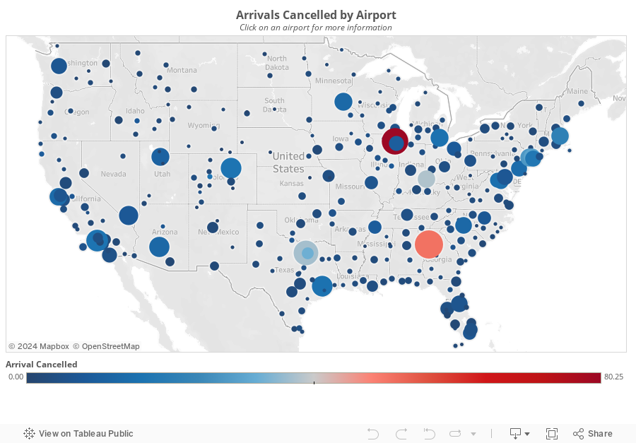
The class of 100 was comprised of only a handful of people that had been using Tableau for more than one year, with about 80% of the class getting a taste of Tableau for the very first time. In 90 minutes, we build 17 different worksheets and one interactive dashboard. You can download the workbook here. This training session was really fun because I had to hold a mic the whole time; this meant I was teaching and building vizzes one-handed. We covered a few major areas, while using the Show Me only once (I like to teach people how to build visualizations without it):
- Bar charts: Ranked bars, Small multiples, Stacked bars, Side by side bars, Stacked % of Total, Bar in bar, histograms
- Line charts: Basic line chart, Multiple lines, Year over year, Small multiples, Forecasting, Moving avg, Area chart
- Maps: Dot maps, Colored dot map, Sized dot map, Sized and colored dots
Subscribe to:
Post Comments
(
Atom
)


Hi Andy
ReplyDeleteI really liked the way you made the user to select the map as the filter and showing the other sheets after selection. I too had played around the floating tiles in tableau , But haven't tried to show something like this. I would like to know the steps in dragging the tiles and hiding the sheets in order to get this as I understand those steps are crucial is setting up this kind of view. Appreciate your help.
Thanks
Vishwanath
Vishwantha, this is done by using containers, not floating sheets. Download the workbook and see how it was done.
Delete