November 9, 2014
Tableau Tip: KPIs and Sparklines in the Same Worksheet
calculated field
,
dates
,
KPI
,
sparklines
,
table calc
,
tableau
,
tips
,
tricks
57 comments
I'm writing this blog post outside of a Starbucks in the Sao Paulo airport. Sao Paulo you say? I'm in Brazil this week with four other folks from the San Francisco Bay Area TUG to help Tableau leaders in Rio de Janeiro and Sao Paulo get their own TUGs started. I see this as a way that I can give more than I take from the Tableau community. Yes, this is what I choose to do with my vacation time (it's a bit of a sickness) and no, Tableau doesn't pay me to do this.
Anyway, as I was on the plane, I thought it would be great to kick off the week with a new tip. Today, I'm writing about combining KPIs and sparklines in a single view. It's very common for business users to want to see KPIs and trends in the same view. These give them a sense for the overall direction of their product and also highlight the most meaningful numbers to them. I often see people create these as separate worksheets in Tableau, but with this post, I'm going to show you how to combine them into a single view.
Combining them into a single view provides a couple of benefits:
- Tableau only needs to render a single sheet, so until parallel processing comes out in v9, you'll see a performance benefit.
- If you have a hierarchy, then expanding the hierarchy will keep the table and the sparklines together.
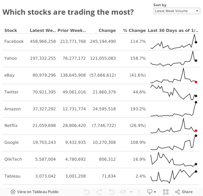
- Trading volume for the last 7 days
- Trading volume for the prior 7 days
- Week over week change (raw & %)
This should be a fairly typical set of KPIs for most products. You could easily expand this technique to include m/m or y/y calculations depending on how your organization calculates those. Here's the final solution, with details on how to create this view below.
Here's how I created this single worksheet view.
Step 1: Add Date to the Columns shelf as a continuous dimension and choose Exact Date, add Stock to the Rows shelf, and add Volume to the Rows shelf.

Step 2: Hide the header for the Date axis and make the Volume axes independent NOT starting at zero.

Step 3: Create calculated fields to determine which dates are in the most recent week and which dates are in the prior week. Note that the table calculations compute along Date.


Step 4: Create calculated fields to get the volume for the latest week and prior week. Note that the table calculations compute along Date.


Step 5: Create calculated fields for the week over week change and percent change.


Step 6: Add Latest Week Volume, Prior Week Volume, Change and % Change to the Rows shelf and then convert them all to discrete. This will make them appear as columns of data. Reorder these discrete measures as you see fit.

Step 7: I like to include an indicator on the end of my sparklines (see this blog post). I do this by creating a calculated field to get the value for the latest date and then add it as the secondary axis. I then color it by the % change.


Step 8: Create a calculated field to filter to the last 30 days, add it to the filters shelf and choose True.

Step 9: Clean up and formatting. I removed the gridlines, removed the lines for the column divider pane, hid the header for Volume, changed the worksheet font size, right justified the discrete measures on the Rows shelf, narrowed the width of the sparklines, made the sparklines thinner, made the headers bold, and bottom aligned the headers.

Step 10: I created a dummy header for my sparklines that shows the "as of date" and added it to the Columns shelf.


Step 11: I created a parameter to let the user decide what they want to sort by. Creating a parameter requires a few steps of its own:
1) Create the parameter

2) Create a calculated field that returns the negative of the value chosen in the parameter. I add the negative for a sort descending effect.

3) Convert the field to discrete, add it as the first pill on the Rows shelf, then hide the header to hide the field.

This doesn't take very long once you do it a time or two. Give it a shot! Download the workbook here.
Here's how I created this single worksheet view.
Step 1: Add Date to the Columns shelf as a continuous dimension and choose Exact Date, add Stock to the Rows shelf, and add Volume to the Rows shelf.
Step 2: Hide the header for the Date axis and make the Volume axes independent NOT starting at zero.
Step 3: Create calculated fields to determine which dates are in the most recent week and which dates are in the prior week. Note that the table calculations compute along Date.
Step 4: Create calculated fields to get the volume for the latest week and prior week. Note that the table calculations compute along Date.
Step 5: Create calculated fields for the week over week change and percent change.
Step 6: Add Latest Week Volume, Prior Week Volume, Change and % Change to the Rows shelf and then convert them all to discrete. This will make them appear as columns of data. Reorder these discrete measures as you see fit.
Step 7: I like to include an indicator on the end of my sparklines (see this blog post). I do this by creating a calculated field to get the value for the latest date and then add it as the secondary axis. I then color it by the % change.
Step 8: Create a calculated field to filter to the last 30 days, add it to the filters shelf and choose True.
Step 9: Clean up and formatting. I removed the gridlines, removed the lines for the column divider pane, hid the header for Volume, changed the worksheet font size, right justified the discrete measures on the Rows shelf, narrowed the width of the sparklines, made the sparklines thinner, made the headers bold, and bottom aligned the headers.
Step 10: I created a dummy header for my sparklines that shows the "as of date" and added it to the Columns shelf.
Step 11: I created a parameter to let the user decide what they want to sort by. Creating a parameter requires a few steps of its own:
1) Create the parameter
2) Create a calculated field that returns the negative of the value chosen in the parameter. I add the negative for a sort descending effect.
3) Convert the field to discrete, add it as the first pill on the Rows shelf, then hide the header to hide the field.
This doesn't take very long once you do it a time or two. Give it a shot! Download the workbook here.
Subscribe to:
Post Comments
(
Atom
)


I might to steal this and try using it for some or our data. Good way of showing both detail and high level in the same view.
ReplyDeleteIsn't stealing it part of the point of me sharing it? :-)
DeleteGents,
ReplyDeleteNicely done, Andy. Lots of subtle goodness here.
As for stealing, I have always told my colleagues and students that in the Tableau Community it is not about Copy and Steal Everything, but rather, Collaborate and Share Everything that makes the community so virtuous.
Good show!
Michael.
Hi
ReplyDeleteI have a requirement which is as follows :
I have 5 rows of data coming from different tables/different extract and it is a MOM calculation. So near to each I have to display an arrow showing where it is up or down.
Can anyone help me with this. Each row is not the same measure but different.
I can try to help if you post a link to a sample workbook or email it to me. Otherwise, try the forums.
DeleteKey Performance Indicators MOM
ReplyDeleteTotal Online Users 1.10%
Total Mobile Users 0.80%
Total Direct Users -0.30%
Total Direct Users Rate -3.60%
Total Mobile Penetration Rate -21%
All the key performance indicators are from different extracts which comes from different tables. I used table calculations and found the MOM . Now I have to display an upper green arrow or lower red arrow near the MOM where I am not able to get a solution
Thank you for this, it is very helpful. How would you add a column that is percent of total for the Latest Total Volume column?
ReplyDeleteCan you please make this workbook available again? The link is broken. Thanks; very helpful.
ReplyDeleteThe link is correct. If that doesn't work for you, you can always download it via the Download button on the Tableau Public viz at the top.
DeleteInstead of last week, I want to display last month. How do I change the calculated field to last month. My date dimensions is shown as January 2014, February 2014, etc. through January 2015. Can you help? Thank you.
ReplyDeleteDATEDIFF ('day', ATTR([Date]), TOTAL(MAX([Date])))<=6
If you're date is at the monthly level, then the calc you have above won't work. You need to change it to month instead of day.
DeleteDATEDIFF ('month', ATTR([Date]), TOTAL(MAX([Date])))<=1
The prior week calculated field appears cut off at the end so it's not viewable. Are you able to provide the entire formula? Thank you.
ReplyDeleteDownload the workbook at the link provided and you can see the formula.
ReplyDeleteAndy,
ReplyDeleteGreat tip. One question as I'm stuck on implementing a variation based on getting previous week to be from say Sun - Sat vs the rolling 7 days you show here.
So for example, with today being 05 MAR I'd like to see current week(01 MAR to today), last week(22 - 28 FEB), and Prv Week(15-21 FEB)
Everything I've tried (max/datepart/week) in several variations which doesn't seem to calculate correctly. Do you have a quick idea/solution to this?
Daniel
N/m Andy figured it out. Used the table calc window_sum with a datetrunc and dateadd to find last week and previous week.
Deletehi Daniel, can you post your solution using datetrunc and dateadd?
DeleteHello vizwiz blog,
ReplyDeleteResearching more on spark lines via google, ran across this post, and wanted to help simplify one of the calcs that I had time to take a look at. --Only looked at this one calc in the blog. Again I rather enjoy the complexity added here, but it appears unnecessary given Tableau's flexibility with last(). Stepping away from 6 functions to give a single circle and increasing the performance of the viz/dashboard, which also gives you a quick and easy to support calc.
Last Update
if last()=0 then sum([Measure]) end
[Measure] can be a measure swap calculated field and complexity of sum/avg/max/etc can be added in that calculated field.
Cheers,
Tyler Garrett
Senior Business Consultant
Professional Services
Tableau Software
Thanks for the tip Tyler!!
DeleteAwesome!!
ReplyDeleteThis is amazing step by step guide! But I really want to adjust a little bit: I want to paint numbers in green/red despite on value positive or negative, is it possible in easy way?
ReplyDeleteSince the numbers in the table are dimensions, you can't do that easily. There are a few very complicated workarounds. You should typically avoid red/green as well since they're not colour-blind friendly.
DeleteAndy, is it difficult to share this information?
ReplyDeleteWhat are you trying to share?
DeleteThank you for this great post. What modification can you recommend, if I am trying to take a unique count of users in a given time period (eg - last week). I am trying to follow your guidelines to reproduce this on a project I am working on. My issue is that instead of summing up the volume as you have done, I am trying to take unique count of users for a given time period. Although I can calculate the unique users and throw it in the view, I am unable to reproduce in a manner which displays both the sparkline and the numerical value in one row.
ReplyDeleteShanti, I would encourage you to download the workbook and dissect how I did it. From there, you'll figure it out for your specific case.
DeleteHey Andy, is there a way to show the same last week data for all Stocks if there is missing data for one of the stocks? And then to add a rank # column to the left of the "Stock" dimension column? What I mean to say is, let's say you did not have data for just Amazon from 1/26/14 and onwards. Using the existing code, you would end up showing the data for the week of 1/19/14-1/25/14 for Amazon instead of zero.
ReplyDeleteYes, you can do that using the lookup function.
DeleteThanks for the quick reply Andy! It's much appreciated. I'm still confused though--I had previously been looking into using INDEX() to create a rank column but have not had much success (the calculated field I created when placed on the rows shelf either ranks correctly but does not sort in sequence or ranks incorrectly but in sequence). Is there some way to combine the LOOKUP() function with INDEX() to create the rank column sorted by latest week volume?
DeleteDaniel, it would be easier for me to help if you posted a link to a packaged workbook that contains an example the problem. This way I can look at how you're built your calculations.
DeleteSure thing Andy. I've actually posted this question to Tableau's community forum as well. Here is the link with the accompanying packaged workbook: http://community.tableau.com/thread/192674
DeleteThe modifications I made to the underlying dataset are: (1) Removal of the last week of data for Amazon and (2) An additional column with the number of shares purchased on the corresponding day.
The "Rank" field is simply a calculated field using INDEX() and calculated using the "Table (down)" setting.
Hello Andy,
DeleteI am new to tableau and am mesmerized your dashboard skills and Awesome work that you do to help us all with good dashboards that we can use in our day to day life.
I just tried to prepare a similar dashboard to show the stock price of stocks during a selected period....and by far I was successful and got what I got. May be would you be able to able to help ? How can I share the dashboard with you
Publish it to Tableau Public
DeleteHi andy , I am a new tableau user but i feel lost in an ocean when learning tableau . Could you please write a post that provides some direction for new rookies to follow while learning tableau . Regards , Vishal .
ReplyDeleteAndy,
ReplyDeleteHow can the 'Latest week volume' and 'Prior week volume' columns be made flexible with parameter where users can enter a range of dates (up to a month period)?
Thanks,
Tam
The calculations in this post could easily be changed to use parameters instead. For example, in the Last Week calculation, you would change the 6 to the parameter instead. Rinse and repeat for the other calculations.
Delete
ReplyDeleteThis is a really helpful guide. Here are the 2 challenges I'm facing:
1 - I need to view the data based on a Sunday to Saturday weekly schedule. I.e., I can't use the max(date) as my reference point. Instead I built a function in its place to find the last Saturday in the data:
if datename('weekday',max([Date])) = 'Saturday' then max([Date])
else if datename('weekday',max([Date])) = 'Monday' then date(max([Date]) - 2)
else if datename('weekday',max([Date])) = 'Tuesday' then date(max([Date]) - 3)
else if datename('weekday',max([Date])) = 'Wednesday' then date(max([Date]) - 4)
else if datename('weekday',max([Date])) = 'Thursday' then date(max([Date]) - 5)
else if datename('weekday',max([Date])) = 'Friday' then date(max([Date]) - 6)
else if datename('weekday',max([Date])) = 'Sunday' then date(max([Date]) - 1)
end end end end end end end
This seems to be working but would appreciate your feedback.
2) The remaining issue I have is that not all dimensions have a max(record) that falls under the same week. So for dimension A, my max(date) is 1/3 (a Sunday) and for dimension B, my max(date) is 1/9 (the following Saturday). So what I get then is 2 different weeks falling under my Last 30 day header and it also messes up my Last Day colored spark dot.
Any suggestions??
Hi Andy,
DeleteI replaced the calculation above with a parameter to set the Saturday date I was wanting and replaced all the references back to that parameter value, which appears to be working from what I am seeing. Do you see any issues with that solution?
Makes sense to me Jonathan.
DeleteThis comment has been removed by the author.
DeleteThanks Andy! I have one last question. I have a ton of dimensions and ideally I could just filter by the top 3 movers (week over week difference) for a dashboard. I'm running into issues with a Top N filter I assume because there are table calculations involved. Is there a good way to work around this?
DeleteThe easiest way to get around it is to put the table calc as a dimension as the first column in your view (assuming the data goes down the table), then add an index table calc as have it filter to the first 3. There are probably simpler workarounds. Just search the forums and I bet you'll find something.
DeleteHi Andy,
ReplyDeleteI'm trying to create something exactly like this post (e.g., summary of the overall KPI, and a sparkline over last 30 days), except where the example in this post has the %age Change value I'd like to display an Up or Down arrow depending on whether the change is positive or negative. I'm trying to do this all on one sheet, rather than creating a dashboard of multiple sheets.
Is this feasible? Any help welcome.
Cheers,
Charlie.
Hi Andy,
ReplyDeleteThank you for this helpful post! I followed it and it works great.
One question though - how would you now show only the top 5 performing stocks?
You can create a RANK calculation and filter to 1-5.
Deletelastweek calculation mentioned as
ReplyDeleteDATEDIFF('day',ATTR([Date]),TOTAL(MAX([Date])))<=6
what isthis 6 ,can you explain on this calculation.
The calculation starts at 0, so this calcs accounts for 7 days 0,1,2,3,4,5,6 where 0=latest day.
Deleteok ,,i have two questions
DeleteATTR(Date) why do we take ATTR here
and what does it retireve and total(max(date) is 31 right ?
Me telling you isn't going to help your development. Download the workbook and reverse engineer it. That's the only way you'll truly learn how these table calcs work.
DeleteHi Andy,
ReplyDeleteI was wondering how you could implement conditional formatting on the "change" columns?
so that the bigger the change, the stronger the shading color.
Placing the calculated field on the "color" icon in the marks card doesn't effect the table at all...
The change columns are discrete, so you can't color them. However, if you want to color the dot on the end of the line as a gradual shading, use the calculation from Step 5 on the color shelf.
DeleteWhat if there are different KPIs like a Volume, revenue and stuff in retail...how do you show them in a similar chart?
ReplyDeleteHi Andy,
ReplyDeleteQuick question -
For the Last week calculation, what is the reason for including the lookup in addition to the window_sum?
ZN(LOOKUP(WINDOW_SUM(IIF([Last Week],ZN(SUM([Volume])),NULL)),0))
It might be totally unnecessary. It's how I did the calc in my head so I went with it and it worked. There are always lots of ways to get to the same result in Tableau.
DeleteHi Andy,
ReplyDeleteI am beginner and recently started tableau. I found your videos are very much interesting. Please can you tell me where I can find data set to work on ?
Join #MakeoverMonday - www.makeovermonday.co.uk
DeleteHi Andy,
ReplyDeletei have replicated the same for one of my assignment, on top of it i would like to see Top and Bottom X records, i have used unique-rank function and dropped it just right to sort field and left to stock, but then the view is splitting up differently for different computations & unable to get the exact row numbers. i have noted that this happen when the date field is in continuous exact day level only..
kindly extend this topic and help to find solution for my query..
Ask for help on the Forums.
Delete