October 5, 2015
Makeover Monday: Taxpayer in Some States are Voting with their Feet
CNBC
,
color
,
context
,
John Schoen
,
Makeover Monday
,
map

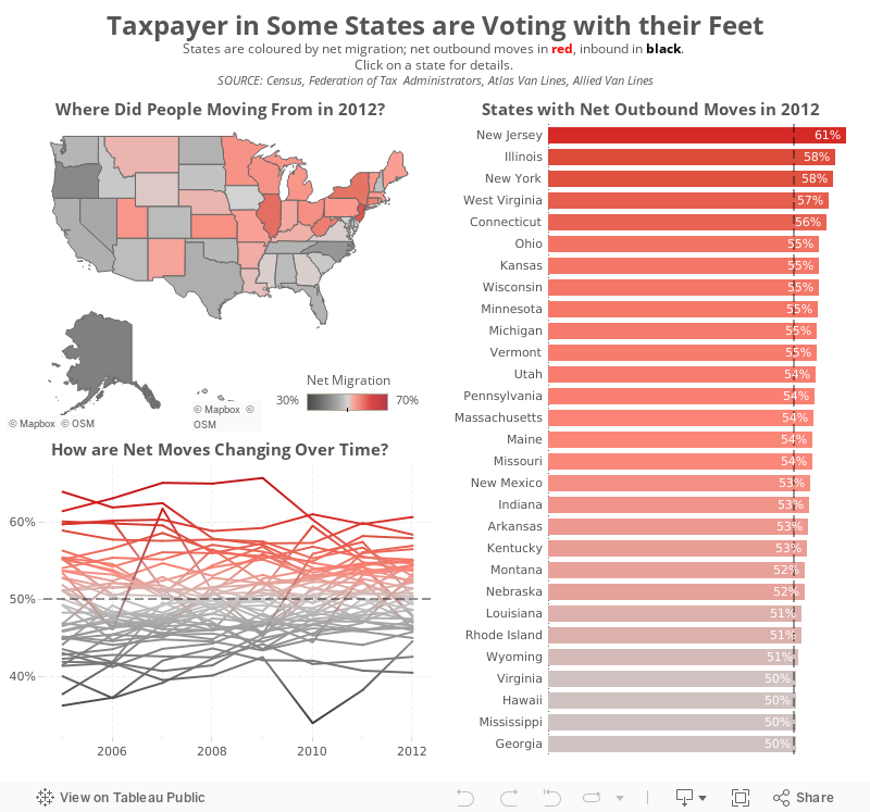
John Schoen over at CNBC is a pretty regular Tableau user and it’s great to see Tableau being used in news organisations. However, I think he missed the mark with this visualisation about taxpayer migration in the US.
Let’s start with the squared map.
How about the scatter plot?
And the line chart?
One of the great things about Tableau Public is that most people allow you to download their workbooks so you can have a play for yourself. That’s exactly what I did in this case. I’ve build the dashboard below to address the communication issues that I feel the original has.
What did I do?
What would you do differently? I’d love your suggestions for making this better.
Let’s start with the squared map.
- While some might see this as cute, it’s quite poor at communicating effectively. It’s difficult to compare the size of the squares. The size legend is essentially useless.
- The colour scale is not colour-blind friendly. I suppose he’s going for a stop light type of look, but that’s not even what this is because it has four colours, not three.
- The placement of the squares is not geographically accurate.
How about the scatter plot?
- Again, why the squares?
- Same colour issues as the map, but at least it’s consistent with the map.
- The annotations he added work well and the reference line at 50% aids in understanding, but both of those are merely encoding the same measure as the colour scheme.
- What is the scatter plot adding that the map is not already showing us?
And the line chart?
- This works well for a single state, but what if I want to compare states? What if I want to see all states at the same time so that I can see if there are any common themes?
- The colour scale is not consistent with the other two charts. Click on California and you’ll see what I mean.
One of the great things about Tableau Public is that most people allow you to download their workbooks so you can have a play for yourself. That’s exactly what I did in this case. I’ve build the dashboard below to address the communication issues that I feel the original has.
What did I do?
- Focused on a single metric, in this case net migration, since that’s what the original story was about.
- Used a single colour pallet that is colour-blind friendly
- Added all states to the line chart. Clicking on a state in the map will highlight the state on the line chart.
- Included a bar chart of the states that have a net outward migration
- Gave the visualisation a more meaningful title
What would you do differently? I’d love your suggestions for making this better.


