June 4, 2015
Dear Data Two | Week 7: Complaints
analogue
,
complaints
,
Dear Data Two
,
frustration
,
lollipop
,
radar graph
,
story points
No comments

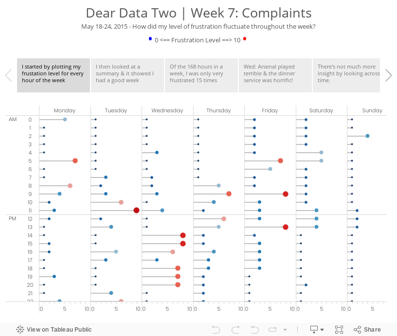
During week 7 of Dear Data Two, I recorded my overall frustation level for each hour of each day of the week. I was at the Alteryx Inspire conference most of the week, so I had to keep data collection simple. I used a scale of 0-10, with zero being no frustration and ten being extremely frustrated.
For week 3 Jeffrey sent me a donut chart by accident (so he says…) and while I was thinking about my ideas for this week, I started connecting some data points with lines and ended up with a radar chart. (See the draft version in the story points.) It’s funny how he and I both have gone against what we would consider best practices. What does that mean??
I decided to go with a clock them this week and split the data up between morning and afternoon. From there, I plotted each day going outward from the centre for that hour. For example, at 12am, Monday is closest to the middle and Sunday is farthest from the middle. This helped me see which hours were cumulatively the most frustrating for me for the week. Each dot is separated by the frustration level. If the frustration level was three, then the dot would be 6mm from the previous dot. I then sized the dots by the frustration level so as to double encode the values.
It’s no surprise that my sleeping hours were generally the least frustrating, except for 5am when jetlag kicked in. Overall, 9am was my worst hour in the morning and 1pm was the worst in the afternoon. The story points viz below goes into more of the explanations.
Subscribe to:
Post Comments
(
Atom
)


No comments
Post a Comment