January 12, 2017
Workout Wednesday: Showing Nothing When 'All' is Selected

Really fun challenge from Emma Whyte for this week’s Workout Wednesday that helped me learn loads! I’ll highlight some of those below, but first, here’s the challenge:
- The dashboard title should change to say 'All Departments' when you select 'All' in the filter
- The department logo should change when you select a department, but disappear when you select 'All'
- The line chart title should update when you change the filter
- All the charts and tooltips should look the same as Emma's
And here’s my final version:
Here are some things that helped me along the way. First, when I need to add a dot onto the end of a line, I usually create a table calc or LOD calc and create a dual axis chart, but that’s totally unnecessary. I never knew that when you turn on mark labels you then have the option to show only the Most Recent. The great thing about this option is it make the mark a dot. Perfect for this exercise!

To get the dashboard title to update dynamically, I created a sheet instead of using the dashboard title. This gives me more flexibility to use calculations. I created this LOD calc to first count the number of categories in the view and then return a string based on that result.

I then placed this new field on the Detail shelf and updated the title of the sheet.
For the department logos, I knew I wanted to only show a shape when “All” is NOT selected, so I created a new sheet and then created this LOD calc that simply checks whether the number of product categories is 1.

I then placed the field on the Filter shelf and chose to Exclude False (keeping True only works too). From there, I placed the Product Category field on the Shape shelf and assigned the shapes for each Department.
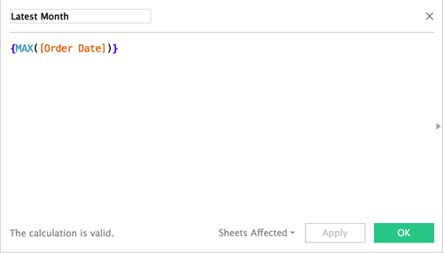
To get the month into the title of the line chart I created this LOD calc to return the latest month.
I placed this field on the Detail shelf and changed it to continuous Month and updated the title. The title is also supposed to show sales for the most recent month. I did this with a table calculation.

That’s about it. The rest was formatting and dashboard layout. Emma floated some things in her dashboard whereas I chose to tile everything. Both work just fine.
Overall, I learned quite a bit and that’s what Workout Wednesday is all about!


Hi Andy,
ReplyDeleteOn replacing 'exclude' with 'include' in your calculated field, I get same results. Wondering why is that.
Andy - same q to you as I put on Emma's post - how did you make the values on the Profit legend not show when you've published the workbook? I formatted the text to white, but downloading your workbook, the values are visible...? (using Desktop v10.1.1) Donna
ReplyDeleteHi Donna. Mine are in a container and I shrunk up the container.
Delete