September 24, 2018
Makeover Monday: Priorities for Progress on Gender Equality


What works well?
- The colors are easy to distinguish.
- The footnotes help to explain the percentages...sort of.
- The chart layouts are easy to understand. Bar charts nearly always work well.
- Labeling the top of each bar removes the need for an axis.
- Good drill down from the overall to the per region level.
What could be improved?
- I find the chart titles quite confusing.
- Comparisons within a single region are difficult.
- I had no idea how to read these charts without reading the article. A chart should, ideally, be able to stand on its own.
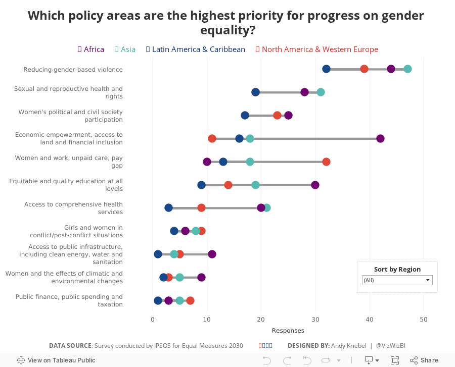
What I did
- I focused on making over the bottom chart.
- I kept the original colors.
- I changed the bars to dots to help show the range of responses better.
- I didn't convert the responses to percentages as I wasn't confident it was accurate.
- I included a sorting option to allow sorting by the total responses or the responses within a region.
- Based on a twitter conversation with Dan Caroli last week, I turned on advanced logging feature which tracks each change you make in a sheet and then I turned them into this gif.

With that, here's my Makeover Monday week 39 for Equal Measures 2030.
Subscribe to:
Post Comments
(
Atom
)


No comments
Post a Comment