August 27, 2019
#TableauTipTuesday: Using Measure Names to Update a Parameter
dashboard action
,
dynamic
,
line chart
,
parameter actions
,
scatter plot
,
scatterplot
,
Tableau Tip Tuesday
No comments
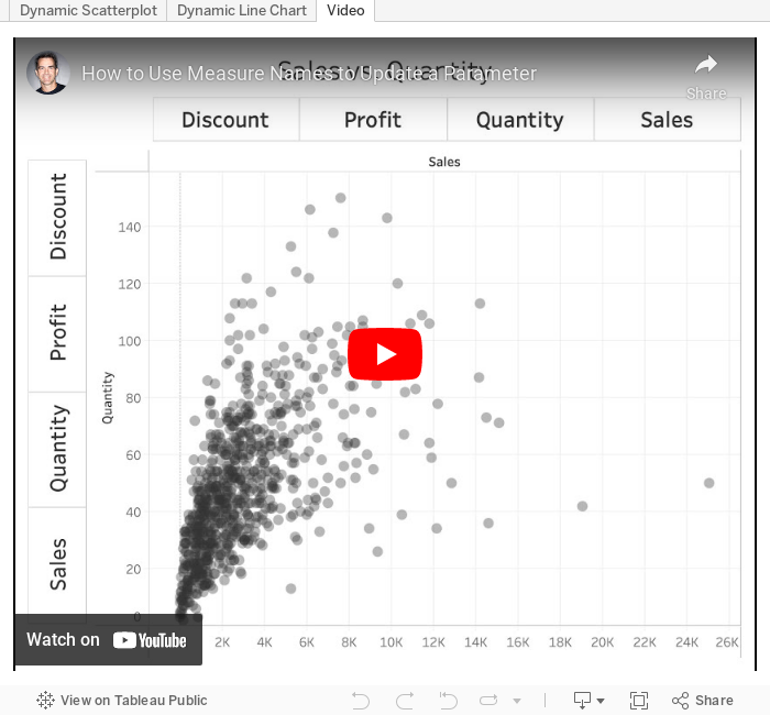
Before parameter actions, we've never been able to use Measure Names in a calculation. This week, I show you how to make a dynamic scatterplot and dynamic line chart by leveraging the power of parameter actions to pass the Measure Names field to a parameter, and thus a calculation.Thank you to Hesham Eissa and Sara Hamdoun of The Data School for coming up with the solution.

August 25, 2019
#MakeoverMonday: Mobile is taking over the global gaming market
console
,
gaming
,
Makeover Monday
,
market share
,
mobile
,
pc
,
revenue
No comments

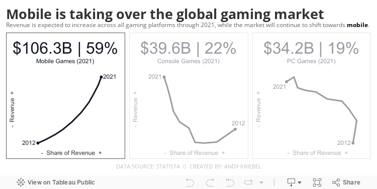
This week's chart is from Statista:

What works well?
- The title clearly explains the story in the chart.
- The colors are easy to distinguish.
- The bar chart helps us see the increasing revenue.
- Placing mobile at the bottom of the stacked bars makes it easy to see the increase in the mobile share.
What could be improved?
- All of the labels make the chart look quite busy.
- Is the image of the platforms necessary?
What I did
- I wanted to look at the relationship of share and revenue over time, which led me to a connected scatterplot.
- I thought it was important to look at each platform independently, so I placed them inside "cards".
- I included BANs based on the estimated revenue for 2021.
Let me know what you think.
August 13, 2019
#TableauTipTuesday: How to Compare Ranks within a Dimension with Set Actions
combined set
,
hide
,
parameter
,
rank
,
set
,
set actions
,
show
,
Tableau Tip Tuesday
No comments
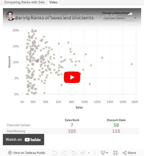
Have you ever needed to compare the rank of items, but only show two of them? For example, you want to show any player compared to Player A. Player A should always be in the view and another play should only be shown when selected.And, when you display any players, you need to show their rank amongst everyone. This is where set actions come into play.
In this example, I show you how to compare any car to a car that you selected from a parameter. The car you select from the scatterplot appears next to the car selected from the parameter and the overall rank for each car is displayed.

August 11, 2019
#MakeoverMonday: The Social Investment of Clinical Trials

- The trial start date on the x-axis.
- The disease/condition of interest on the y-axis.
- Each bubble in the figure corresponds to a trial.
- The bubble color corresponds to the company
- The bubble size corresponds to the number of human subjects enrolled.
- The bubble shape indicates the trial’s current status.
So basically you need to be able to understand quadruple encoding of the bubbles, which is quite difficult. It's very hard to visualize data that is this dense; kudos to the author for giving it a go.
 |
| SOURCE: AERO DATA LAB |
WHAT WORKS WELL?
- The article reference provides a good overall analysis of the data.
- Including the trial start dates on the x-axis helps understand when the trial took place.
WHAT COULD BE IMPROVED?
- Too many colors
- The x-axis labels are slanted.
- It's way too long (but I understand why it was designed that way).
- There aren't any legends.
- There are too many shapes.
- The bubbles are trying to do too many things at once.
- Comparisons are very difficult.
WHAT I DID
I had thought about examining the costs, but there isn't an information about the costs, even though the article references it. Instead, I decided to focus on the scale of the enrollees; that is, the number of people participating in each trial.
- I used BANs for the enrollees per pharmaceutical company. I then used this as a set action to highlight that company in the line chart.
- I looked at the enrollees per status, but I don't think that makes sense since it's the latest status.
- The same applies to the phase; it also only shows the latest phase.
- I looked at how many enrollees there have been since the start the first trial for each company.
- I included the enrollees per condition and used a set action for proportional brushing for the company selected.
I'm about to head on holiday for eight days, so I had to get this one out the door.
August 5, 2019
#MakeoverMonday: Britain's Reduced Dependency on Coal
Britain
,
coal
,
energy
,
Makeover Monday
,
UK
,
united kingdom
No comments


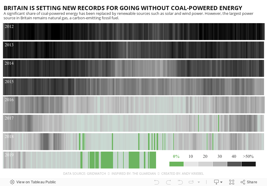
WHAT WORKS WELL?
- Great color scheme
- Easy to understand layout
- Good color legend
- Informative title and subtitle
WHAT COULD BE IMPROVED?
- Not much; it's quite fantastic.
- Maybe make it more interactive so you can see the specific values when you hover
WHAT I DID
I wanted to see if I could rebuild this viz because it looks so good and it would be a good learning experience for me. Creating the viz was pretty straightforward. The tricky part was getting the colors to work just right. I did that through a calculation that makes 0% go to -20% so that the color range would be close to the original.
Lastly, I wanted to change the title and subtitle to something different that explains the data better. I pulled some text out of the article by The Guardian.
Subscribe to:
Posts
(
Atom
)


