October 19, 2016
Tableau Tip Tuesday: How to Create a Diverging Bar Chart with One Measure
bar chart
,
bikini chart
,
diverging
,
diverging bar chart
,
index
,
table calculation
,
Tableau Tip Tuesday
4 comments

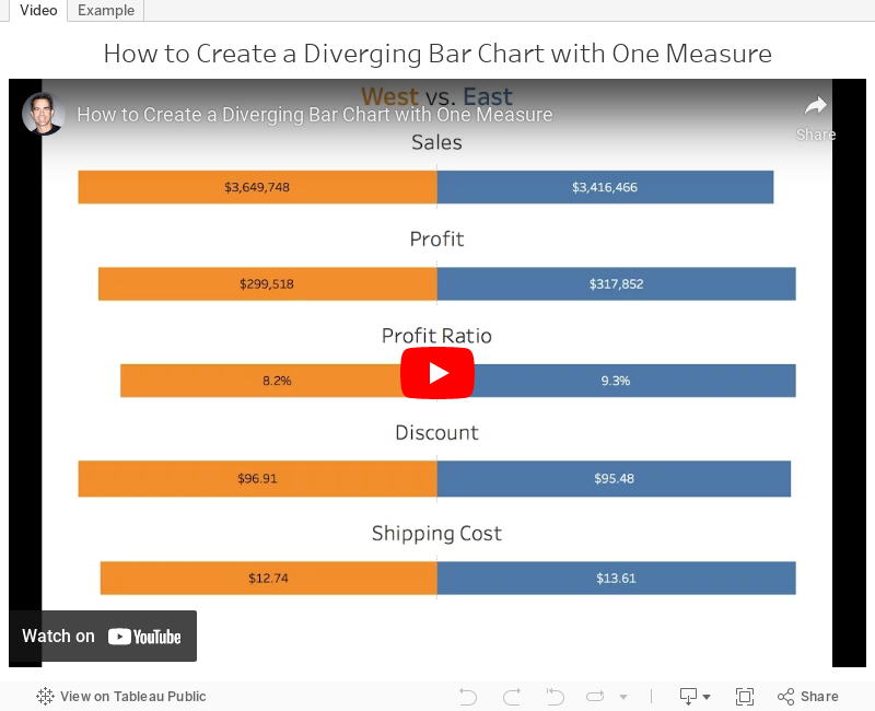
With a cheeky use of the INDEX table calculation, this was quite straightforward. In the video below, you'll see that the middle of the charts aren't lined up. I fixed this by using the INDEX calc again. You can download the workbook to see how I got it to work.
Subscribe to:
Post Comments
(
Atom
)


Hello, Andy.
ReplyDeleteI'm trying to use your tutorial as an exercise about how to make these divergent charts. So I downloaded your workbook and I have seen that you included again "Sales" in the columns, now with INDEX()=2, what centralizes the 0 point.
I tried to reconstruct your chart, but in the end what I got was a chart with a centralized 0 point, but overlapping values. Do you have any idea about how to solve this problem? Thanks in advance.
The trick you're missing is that I made the secondary axis (INDEX()=2) a negative. This makes the axis go the opposite direction instead of overlapping. Then you format the value so that it displays as positive.
DeleteThanks a lot, Andy. Gave me some light. :)
DeleteThank so much Andy.
ReplyDelete