April 30, 2017
Makeover Monday: Going to Sydney? Take the Ferry!

This viz to makeover was created by Transport for New South Wales and I believe they'll be in attendance for the Sydney TUG on Monday to see everyone's makeovers.

What works?
- Data points are in sequential order
- Colors are used consistently
- Each chart title tells us exactly what the chart is showing
- Including instructions on the filters
What could be improved?
- Dashboard needs a more meaningful, engaging title
- Too many colors
- Since the blue segment (adult) makes up such a large percentage, make it to bottom slice to it's easier to compare its contribution over time.
- Include more months
- Scrap the table, it's not needed
- Scarp the stacked bars, unless you reduce the slices (How about three categories? Adult, children, other)
- I have no idea where any of these stations are. Is that important?
- Are people taking the ferry more or less? I can't tell with their viz.
- Overall, a LOT of simplification needs to be done.
My Makeover
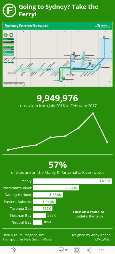
I've never been to Sydney, so I was thinking about what would be important to me.
- I'd probably be using my phone as I try to find a ferry terminal, so make it a mobile dashboard.
- Are there more or less trips over time? Does that hold true for each route?
- Which are the busiest routes? I might want to avoid those if I don't like crowds.
- All of the ferry lines and the logo are green, so use that as the primary color.
With those ideas in mind, I created a simple, mobile-friendly dashboards that answers these most basic of questions.
Subscribe to:
Post Comments
(
Atom
)


nice simplification for an outsider. but i think the audience are people from sydney so they would expect to see more details. i agree that tables are not the best way to present this kind of data. not sure how to add more granularity without adding too many marks. maybe we could focus on top 5 routes. i love the idea about aggregating some of the smaller categories within type of customer.
ReplyDelete