May 21, 2018
Makeover Monday: How well did The Guardian predict the Premier League table?
English Premier League
,
EPL
,
football
,
Guardian
,
Makeover Monday
,
soccer
,
sports
,
unit chart
3 comments


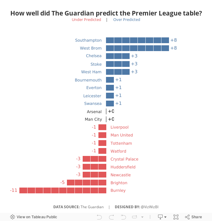
What works well?
- Sorting the teams by prediction makes sense since this is an evaluation of their performance against their prediction.
- Including the logos so people can find their favorite team
- Including the numbers for the table position so that the reader doesn't have to count as they go
- Shading every other row helps break up the view
What could be improved?
- If you don't know the team logos, it can be hard to track a team across the table.
- It's hard to see which team did better and worse than expected.
- There's no scale for how "well" The Guardian predicted the table.
My Goals
- Focus on the difference between the predicted and actual results
- Try to create some sort of unit chart (I didn't have time to figure out the calcs, so I cheated with distribution bands)
- Make it easier to see if team finished above or below the predictions
- Finish in under an hour because we did MM live at the Data School and had to present to Eva at the end of the hour
Subscribe to:
Post Comments
(
Atom
)


The workbook is available for download. Try to reverse engineer is rather than me telling you. You’ll learn more.
ReplyDeleteWhy is that team A coming on the top hidden in white????
ReplyDeleteI needed some extra space for the annotations so added two dummy row, one at the top and one at the bottom. I made them white hoping no one would notice. :-)
Delete