August 24, 2010
Updated Agenda: August Atlanta Tableau User Group Meeting
The next ATUG meeting will be August 26 @ 1PM ET
Who - All ATUG members and guests
What – The August in person hands on meeting
Where - Norfolk Southern building located at 1200 Peachtree St NE. Atlanta, GA 30309 -Peachtree room
Agenda:
- SPECIAL GUEST: Rina Bongsu-Petersen - Winner of the Tableau Read Write Web DataViz Contest
Sneak Preview: http://emr.depaul.edu/fitandfat.html - Guest Speaker: Joe Mako - Benefits of Preprocessing Data
- Drawing lines on maps - Andy Piper, Norfolk Southern
- Team project – tick tock, tick tock - show us what you’ve got
-- This will be a hands on session - Bring your laptop and Tableau with you --
August 9, 2010
Should you use a log scale vs. zero-based scale for comparisons?
barchart
,
change
,
linechart
,
logarithmic scale
,
perceptualedge
,
stephenfew
,
zero-based scale
No comments
I finished re-reading Show Me the Numbers by Stephen Few last week and in Chapter 10 there is a discussion about Scale Lines, a subsection of which is devoted to logarithmic scales. Stephen made one particular recommendation that caught my eye (p. 199):- "Whenever you want to compare differences in values as a ratio or percentage, logarithmic scales will do the job nicely. They are especially useful in time-series relationships if you wish to compare ratios of change across time."
On p. 200, Few goes on to say:
- "When you use lines to encode time-series along a logarithmic scale, angles that are the same tell you that the rate of change is the same."
Personally, I try, whenever possible, to avoid using a logarithmic scale. They tend to be very difficult to interpret and, for me, it's much easier to understand a graph that shows % change on a zero-based axis. Let's look at an example of both starting with a bar chart.

On this bar chart, it's challenging, but you could make the assumption that both bars are changing at the same rate. This same chart is much easier to read as a line chart like the following:

On this line chart, it is much easier to see how both line have roughly the same angle of ascent leading you to believe that they have approximately equal rates of change.
However, if you look at the same line chart, but with a zero-based axis, you get a much different message:

You can now much more clearly see that the percentage change year to year for the two measures is very different. (NOTE: I have hidden 2001 from this chart because it is the reference point from which the measures begin.) In fact, the logarithmic scale would lead you to believe that there is a positive percent change, however, it is clear from this zero-based line chart that it's quite to opposite.
In the end, I urge caution when using logarithmic scale and my suggestion would be to use a zero-based scale to represent percentage change whenever you can.
August 6, 2010
Tableau Public: Afghanistan War Logs
afghanistan
,
interactive
,
tableau
,
tableau public
,
war
,
wikileaks
1 comment
This is the first workbook I've published to Tableau Public. You can click just about anywhere and the visualization will update. It's pretty obvious that nearly all of the activity is on the Afghanistan/Pakistan border. At least that has been reported relatively accurately.

August 3, 2010
Tableau Tip: Using the COUNTD function with Excel
At the July 2010 Atlanta Tableau User Group meeting I was demonstrating how to create a Pareto chart in Tableau using the Superstore Sales dataset. Since I am a curious fellow, I plotted a reference line at 80% so that I could determine how many customers represent 80% of the profit. But wait, when you're using Excel as your data source, you cannot use the count distinct (COUNTD) function.
According to Tableau's documentation, you cannot count the distinct number of items in a group, e.g., the distinct number of customers. Here is the actual text from their website:
- COUNTD(expression)
Returns the number of distinct items in a group. Null values are not counted. This function is not available if you are connected to MS Excel, MS Access, or a text file. You can extract your data into an extract file to gain this functionality.
I thought I hit a wall. But I was determined and came up with a workaround. If you'll note in the graph above, there are 8 customer records. This is the number of records for that specific mark when you use the COUNT function; it's counting up the number of records in the dataset with that specific customer's name.
What I really wanted to know was how many customers are there to the left of 80%, i.e., the number of distinct customers. How did I do it?
First, I created a calculated field called # of Customers.
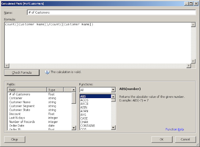
The formula is incredibly simplistic. Divide the count of customer records by the count of customer records. The result will always be one.
Next, add this calculated field to the Level of Detail shelf and create the Running Total of the Sum calculation as seen below.

Lastly, annotate the mark that's closest to 80%. Eureka! We have now identified that 145 distinct customers account for 80% of the profit.
I've only been able to get this calculation to count properly when working with a running total calculation and you have to create the calculated field for each of your dimensions, but at least it works in some situations.
In merely a minute or two you could easily identify that 345 products account for 50% of the sales.
Subscribe to:
Posts
(
Atom
)


