July 24, 2017
Visualizing 909 Weeks of the U.S. Drought Monitor
Alteryx
,
drought
,
geographic
,
map
,
Mapbox
,
practice
,
shapefile
,
tableau
,
United States
1 comment
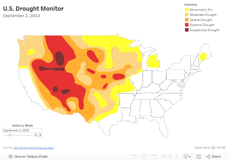
This weekend I wanted to learn how to combine 909 shapefiles into a single shapefile with the goal being to create a motion map of the US drought. As of this writing, Tableau doesn't have a way to union shapefiles, so this was a chance to practice Alteryx.
Here's a video of the motion map, followed by details of how I created it.
I started by going to the Drought Monitor website and downloading the weekly shapefiles for each year. These all comes down as zip files, which when you unzip show other zip files that need to be unzipped. That part is simple. Now, how do I go about combining them into a single shapefile?
This is where Alteryx is super handy. Notice how simple my workflow is. Damn Alteryx makes this work easy!
- Filter to a single date
- Double-click the Geometry field
- Add the Intensity field to the Color shelf
- Zoom to the continental US
- Change the background map to a custom Mapbox map I created that only shows the state borders
Boom! That's it! Super simple! Caution: This may be super slow to render.
I also thought it would be cool to see every week at the same, meaning 909 maps in a single view. I had to hack the Tableau workbook XML to make the dashboard 8000 pixels wide and the view is super slow to render, so you've been warned if you click on the image below.
Subscribe to:
Post Comments
(
Atom
)


This is awesome! Andy. Alteryx definitely expands Tableau's abilities to handle spatial data. Thanks for providing such great work !
ReplyDelete