March 25, 2018
Makeover Monday: What is the UK's Favorite Chocolate Bar?
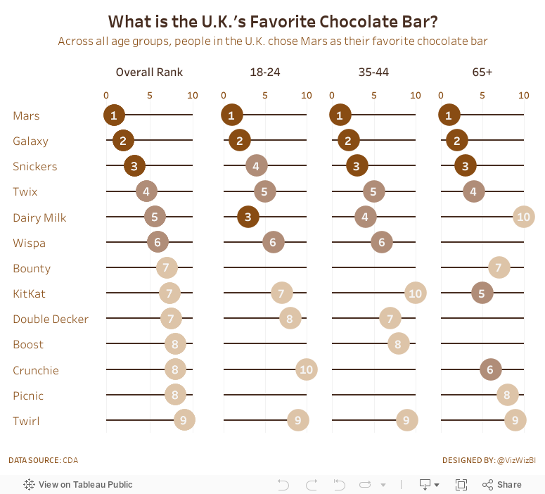
The chart we're making over this week is from CDA.

What works well?
- The bump chart is a very nice visual display for ranked data.
- Including the rank as a number at each point.
- The lines are easy to follow.
- Labeling both the left and right side so that you don't have to trace the line back to the start when you get to the end.
- Using a different mark type when the chocolate is not ranked.
- Simple title and subtitle.
What could be improved?
- This is a LOT of colors and some of them are very close to each other.
- Why are there age bands missing?
My Objectives
- Split each of the age groups out rather than connecting them and then include a total, which is the average across the age groups. I'm making the assumption here that the same number of people were surveyed in each age group.
- Display the data as a dot plot along a scale from 0-10 for each chocolate bar for each age group
- Use a brown theme to go with the connotative color of chocolate
- Color the values using a brown scale
Subscribe to:
Post Comments
(
Atom
)


No comments
Post a Comment