November 26, 2018
Makeover Monday: The Cost of a Night Out
bump chart
,
cost
,
food
,
Makeover Monday
,
rank
,
stacked bar chart
,
statista
No comments


What works well?
- Choosing a topic that is relatable
- Good title and subtitle
- Sorting the bars from most expensive to least expensive
- Using colors that are easy to distinguish
- Including the labels on the ends to the bars
What could be improved?
- Lose the icons on the lower right
- Remove the gridlines and axis labels (they're not necessary if the ends of the bars are labeled)
- Remove the flags next to each city; First they add no value. Second, the data is about cities not countries.
- The title is a bit misleading; this is only a selection of cities.
- Using a stacked bar chart makes comparisons across the items difficult; maybe if this was interactive and you could choose the item to sort by, it would work better.
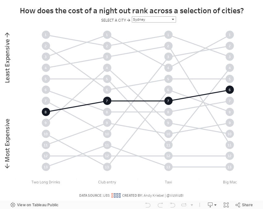
What I did
- I wanted to make the comparisons easier, so I chose to create a bump chart.
- I added a highlight selector so the user can focus on a single city, yet keep the others in the view for context.
- I sorted the values from least expensing (top) to most expensive (bottom).
With that, here's my Makeover Monday week 48.
Subscribe to:
Post Comments
(
Atom
)


No comments
Post a Comment