October 6, 2016
Progress for Sci-fi Reviews by Women
emma cosh
,
label
,
makeover
,
sci-fi
,
slope graph
,
women
2 comments

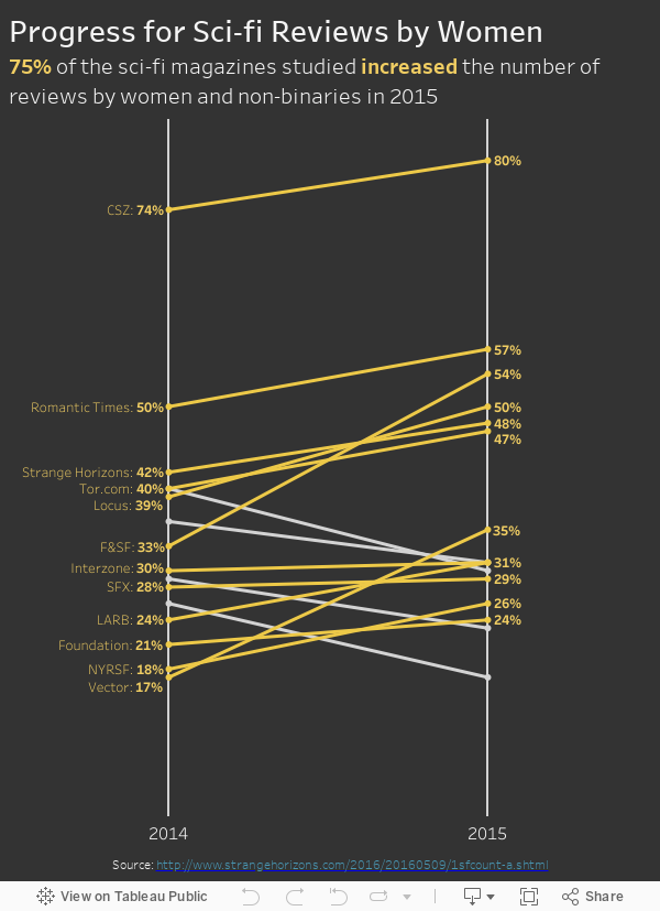
This also got me thinking about the work by Stephanie Evergreen and her focus on effective, impactful titles. I recommend to people that when they are creating visualisations, assume the audience will see a static image. If they can't understand it, then it should be changed.
First, here's the visualisation that Emma created:
 |
| Click for the interactive version |
There are a few things I would change:
- Give it a stronger title that explains the visualisation and the key message
- Only label the lines that are increasing
- Only show the magazine name on the left label to minimize the text
- Make the footer legible (brown on black is too hard to read)
The workbook wasn't downloadable so I recreated all of the data manually. I made the changes noted above, which are all pretty minor. Most importantly, though, the viz now has a stronger title and gives the reader a much clearer message. As Stephanie Evergreen says:
If you do nothing else to improve a weak visualization, you’ll still seriously improve its interpretability by giving it an awesome title.I certainly wouldn't classify Emma's viz as weak, it merely could be more effective.
Subscribe to:
Post Comments
(
Atom
)


Interesting make-over, as you haven't changed the viz at all, just the annotation around it.
ReplyDeleteThe annotation layer is vital in telling the audience what it is they are about to look at. In this case the title and pre-amble lets me know what i am about to discover and then the viz is the evidence. Without that explanation its hard to see what the story is.
I'm happy to hear that came across Matt. That was exactly my intent. The visualisation itself is really good, but a few simple tweaks can make it even better.
Delete