Showing posts with label accessibility. Show all posts
December 11, 2017
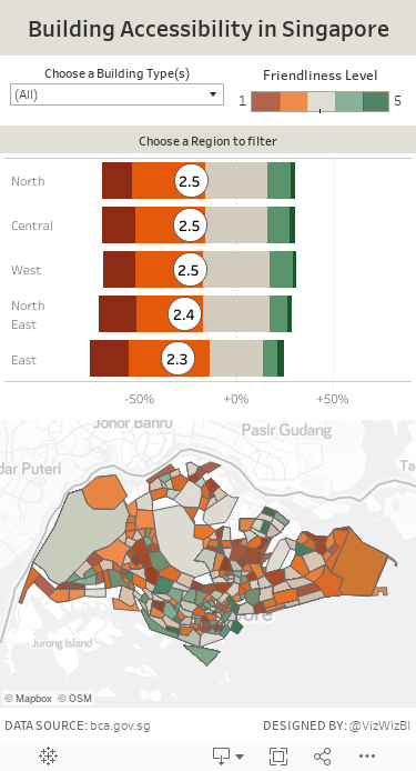
Makeover Monday: Building Accessibility in Singapore
Anyway, Eva posted this viz for us to makeover:

What works well?
- The flashing dots tell you where to click.
- Nice zoom action
- Showing the rating out of five in the pop up provides useful information.
What could be improved?
- Just about everything. The viz is all over the place and incredibly busy.
- The viz needs focus so I know where to look first.
- There are too many colors.
- There are too many symbols.
- The legend is massive! Make it smaller.
My Goals
- When I started exploring the data, I noticed the likert scale value recorded for each building. Therefore, I thought of creating a survey visualisation similar to this one from Steve Wexler.
- Create a map of the average score for each postcode.
- Provide the survey results at the region level and use that to drill down into that region in the map.
- Create a mobile-friendly viz.
With those goals in mind, here is my Makeover Monday week 50.
May 29, 2017
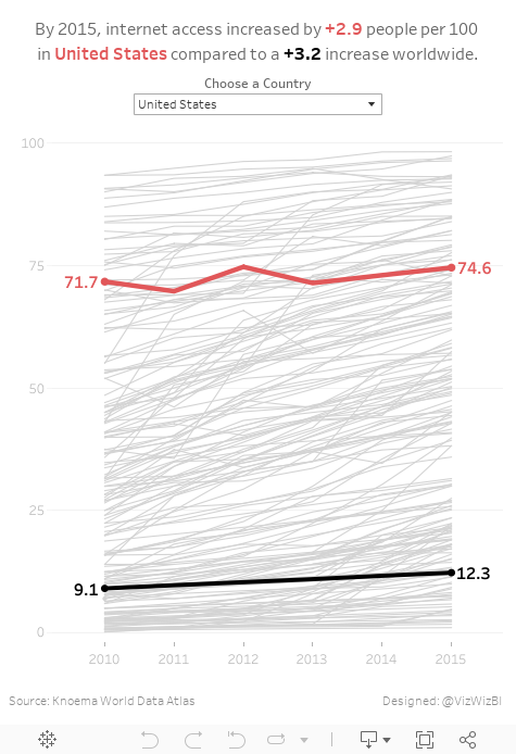
Makeover Monday: How Has Internet Access Changed Around the World?
accessibility
,
comparison
,
country
,
highlight
,
internet
,
line chart
,
Makeover Monday
,
map
,
rates
,
time series
,
usage
11 comments
For #MakeoverMonday week 22, Eva picked an interactive map from Knoema that shows internet access over time.
| Click image for the interactive version |
What works well?
- Nice interactivity
- Informative tooltips
- Summary in the subtitle provides some context
- Including a definition of an internet user
- Highlighting on the timeline the block for the year you are seeing
- Providing the context of "per 100 people"
- Per 100 people makes it easy to understand because you can think of them like percentages
What could be improved?
- Include a more engaging title.
- Stoplight colors work ok for me, but not for the color-blind folks.
- The color scale in this case makes anything below 75% look bad. Is that really the case? Isn't providing more access over the years more important?
- Why are years without data included on the timeline?
- Having to flick through the years prevents you from seeing the change over time.
- Smaller countries get lost on filled maps
- Needs more context
What were my goals?
- Create something easy to understand
- Only include 2010-2015 since those were the only reliably consecutive years
- Eliminate countries without values for 2015
- Allow the user to pick a country to spotlight
- Be able to compare that to the worldwide average
- Label the ends of the lines for context
- Include a title with a summary of what happened between 2010 and 2015
With that, here's my Makeover Monday week 22 creation. Enjoy!
July 5, 2016
Tableau Tip Tuesday: How to Swap Between Colorblind and Colorful Dashboards

This week’s Tableau Tip Tuesday came about from a question during the panel discussion portion our Zens on Tour event in Edinburgh yesterday. Zen Master Craig Bloodworth came up with a very elegant solution that I’ve built upon.
This is super handy for those that need to build dashboards for accessibility purposes.
Enjoy!
Subscribe to:
Posts
(
Atom
)


