December 11, 2017
Makeover Monday: Building Accessibility in Singapore
Anyway, Eva posted this viz for us to makeover:

What works well?
- The flashing dots tell you where to click.
- Nice zoom action
- Showing the rating out of five in the pop up provides useful information.
What could be improved?
- Just about everything. The viz is all over the place and incredibly busy.
- The viz needs focus so I know where to look first.
- There are too many colors.
- There are too many symbols.
- The legend is massive! Make it smaller.
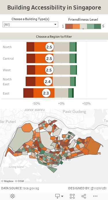
My Goals
- When I started exploring the data, I noticed the likert scale value recorded for each building. Therefore, I thought of creating a survey visualisation similar to this one from Steve Wexler.
- Create a map of the average score for each postcode.
- Provide the survey results at the region level and use that to drill down into that region in the map.
- Create a mobile-friendly viz.
With those goals in mind, here is my Makeover Monday week 50.
Subscribe to:
Post Comments
(
Atom
)


No comments
Post a Comment