June 12, 2017
Makeover Monday: How old was artwork when it was purchased by Tate?
art
,
black and white
,
Makeover Monday
,
monochrome
,
Tate
,
unit chart
,
William Turner
No comments
What works well?
- A pie chart with two slices is really easy to understand.
- The slices are labeled so I don't have to guess at their values.
- The colors are easy to distinguish.
- The largest slice starts at 12 o'clock.
What could be improved?
- There's no title.
- Who is Turner? Why does he have such a large proportion?
- Is the data accurate? HINT: No, it doesn't match with the data on GitHub.
- There's no reference to the source.
- There's no really story to it. When I ask "so what?", I can't answer the question.
- It's boring.
What were my goals?
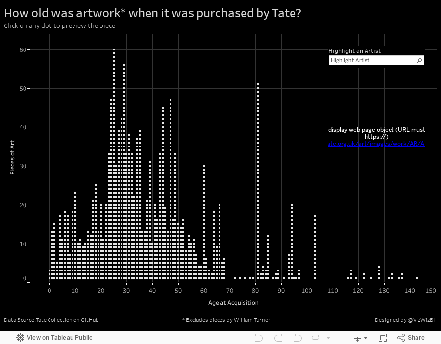
- Since Turner makes up 95% of the artwork, I'm more interested in everyone else. I've filtered out Turner.
- The Tate seemed to make purchased in bunches. Instead, how about looking at how old pieces are when they are purchased?
- What is the distribution of the age of the pieces purchased?
- Provide an option to find an artist.
- Include a way to view the piece of art as a thumbnail.
- Display every individual piece of art (inspired by Pooja Gandhi).
- Provide details in the tooltip.
- Make it look a bit more "artsy" by going with a monochrome theme.
Overall, this data set proved pretty challenging to find any insights. Turner was such a large proportion that I couldn't see anything in the data until I got rid of him. It also helped to hide all of the fields I didn't want to use. Two simple, yet effective ways to make the data more understandable.
Subscribe to:
Post Comments
(
Atom
)


No comments
Post a Comment