November 8, 2017
Workout Wednesday: Stock Portfolio
calculations
,
data prep
,
Jeffrey Shaffer
,
portfolio
,
reshape
,
stock
,
Workout Wednesday
3 comments
Here's what you need to do:
- Download the data here. You will most likely need to do a bit of data prep like pivoting, at least I needed to.
- Match the title
- Match the legend
- Match the tooltips
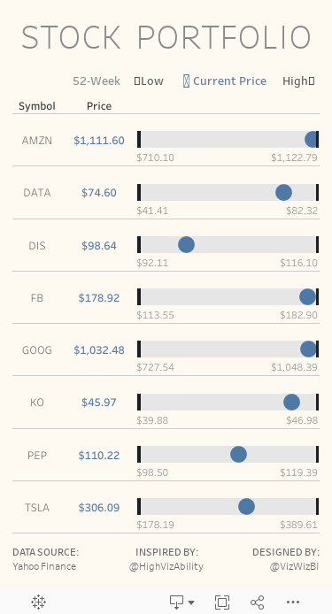
- The black bars represent the 52-week low and 52-week high for each stock and the text below each bar also shows these values.
- The blue dot represents the latest price.
- Size should be 375x667 to fit on a mobile device. If it doesn't display properly on my phone, then it's not right. Use Device Designer.
- Rebuild everything to look identical to mine.
Good luck!
Subscribe to:
Post Comments
(
Atom
)


Hi Andy,
ReplyDeleteI am not sure what I am doing wrong- I downloaded your Viz as well as the data set & got to work. I pivoted Adj Close, Close, High, Low, Open, and Volume. And renamed Pivot Field Names to Metric and Pivot Field Values to Value. Then created the calculated fields for the values of the metrics. All very simple.
I like to check my numbers periodically to make sure everything is adding up, and my calculated fields for the metrics are off- about 6x that of yours. For example, I am getting a sum of 3,546,928 for 'High' while yours is 645,369. Additionally, I checked to make sure there were no filters/default aggregation/number format differences in our workbooks while I was checking these numbers. The only thing I can think of is there are 6 Metrics (Adj Close, Close, High, Low, Open, and Volume) so maybe there is some correlation there?
I appreciate your time and thank you for helping us grow in our Tableau Skills.
Have you compared your calculations to mine? It sounds like the filtering inside the calc might not be quite right, but it's hard to tell given the details you provided.
DeleteHi everyone. Katie you get different values that Andy, because the data set Andy uses is filtered previously to show only the last 52 weeks. I guess Andy uses a data source filter, and it's why you don´t see this filter in the worksheet.
ReplyDeleteYou must create a calculated field that compute the last 52 weeks by company, and then you can make two things, as Andy did, use it as data source filter or use it as a context filter.
Sorry for answering to late :) and I take this opportunity to thank Andy for help to grow my Tableau Skills, I hope someday be like you