March 5, 2018
Makeover Monday: How good are policymakers at estimating indicators related to girls and women?
comparison
,
dot plot
,
equal measures 2030
,
estimates
,
girls
,
goals
,
politics
,
women
No comments
I ended up skimming through parts of the main report to get a better idea as to what the survey is about and any interesting findings they might describe.
In the end, there were major themes:
- Policymakers are really out of touch with the issues facing girls and women in the five countries in the study.
- Policymakers "think" they know what's going on.
Really, it's quite a sad situation. When policymakers are so far disconnected from the truth yet think they are close, I suspect not enough action is taken. I guess that's politics.
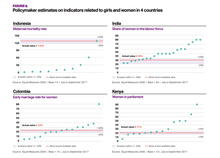
It took me a good 15 minutes to comprehend what the original chart was even about. Apparently it shows how far policymakers' estimates are from the actual indicators.
What works well?
- The bands for +/- 20% from the actuals helps give context to the estimates from policymakers.
- The country titles and subtitles for the topic make is easy to know what each chart is about.
What could be improved?
- What do the green diamonds mean? Apparently they are policymaker estimates, but there's no indication of that in the dashboard.
- Why are these topics picked for these countries?
- Why is Senegal excluded?
- A more impactful and descriptive title would help.
- It's unnecessary to include the source and legend with each chart.
My Goals
- Try to understand the data; easier said than done
- Understand the spread of each topic within each country
- Show ALL responses
- Allow the user to filter and drill in to the topic they are interested in.
- Stick to the overall style guidelines from Equal Measures 2030
- Include BANs for the number of policymakers that estimated within +/- 20% of the actual values
I don't love my final dashboard, but after working on it for far too long, I figured it was "good enough". It could probably use an explanation somewhere for how to read the charts.
Click on the image for the interactive version.
Subscribe to:
Post Comments
(
Atom
)


No comments
Post a Comment