September 17, 2018
Makeover Monday: How does the cost of a ticket change as your trip approaches?
europe
,
Makeover Monday
,
places
,
trains
,
travel
No comments


What works well?
- Simple title and subtitle that explain what the viz is about
- Line colors are easy to distinguish
- Good small multiples layout
- Reversing the time scale so that the larger number is to the last since it represents more days in the past
- Making the obvious
- Sorting the routes by distance
What could be improved?
- Reduce the font size for additional information like the footnote and the source
- Move the subtitle closer to the title and add space between the subtitle and the first chart
- Label the ends of the lines
What I did
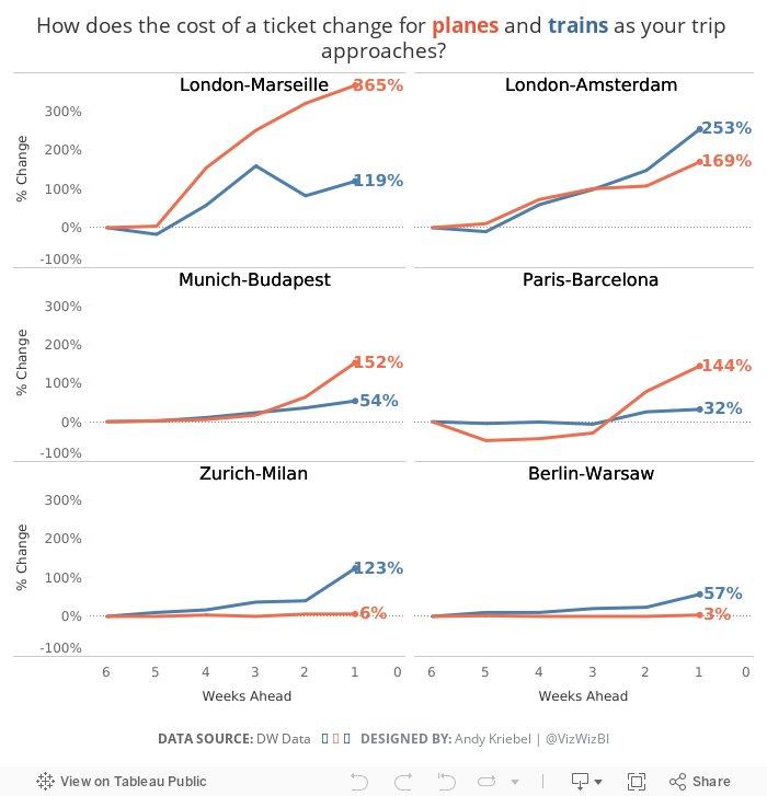
I don't mind the original too much other than I feel like it's missing some context. I decided to basically recreate the chart, but show the change in price as the days got closer. For me, this helped show how much more expensive tickets will be if you wait until the last minute.
Subscribe to:
Post Comments
(
Atom
)


No comments
Post a Comment