March 13, 2017
Makeover Monday: Who Has the Best Orgasm Frequency?
icon
,
infographic
,
Makeover Monday
,
orgasm
,
sex
,
unit chart
No comments
Let's take a quick look at the original viz by Anna Vital, an information designer based in San Francisco.
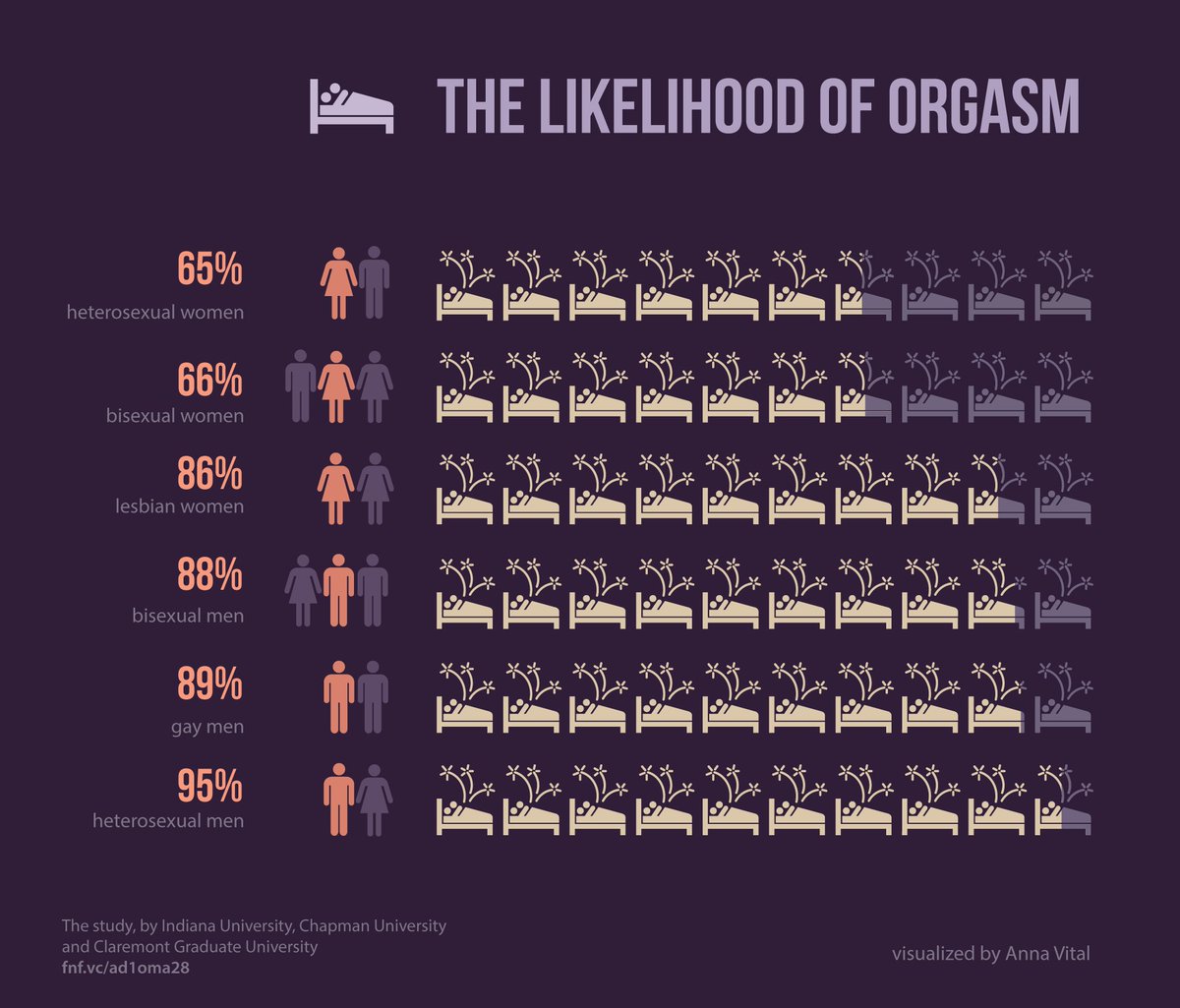
What works well?
- Orange text on the dark purple background
- Title captures your attention
- Using icons for the relationship type
- Nice big numbers
- Bed icon that looks like it has shooting stars coming out of it
- Metrics are sorted
- Including references to the data source
- Simple, organized layout
What doesn't work well?
- Bed icons are partially shaded, which makes it tough to know the exact amount each bed is shaded. However, including the large numbers helps offset this weakness.
- Light purple is really hard to read
- Could use a better title; this one captures our attention because it's about sex
- Should the icons that are shaded as out of the range still have the fireworks coming out of them?
- Sorting from worst to best; I would sort the other way around to emphasize the positive
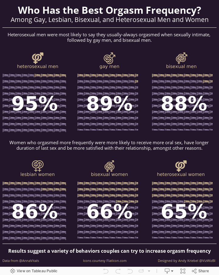
To understand the data better, I read the abstract from the original study. This helped me understand the points I wanted to highlight. I thought about creating a waffle charts, however, I wanted the viz to look more like an infographic, so I switched to 100 bed shapes. These are then highlighted based on the orgasm rate for the group.
I liked Anna's big numbers, so I've include those as well. Instead of using male/female icons in different collections, I used icons from flaticon.com. Lastly, I included some of the text highlights from the study extract to provide additional context.
Subscribe to:
Post Comments
(
Atom
)


No comments
Post a Comment