May 3, 2017
Workout Wednesday: Appearing & Disappearing Charts
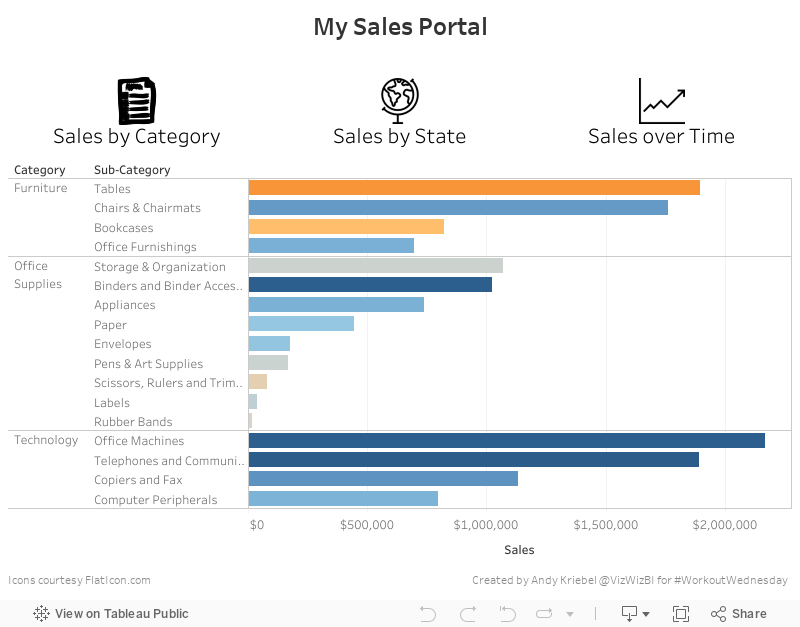
You can find the requirements over on Emma's blog. Here's my solution as a GIF:
The showing/hiding of the charts was pretty straightforward. My data doesn't match Emma's exactly despite using the same data source. I think maybe there's a join or data source filter on hers, but that's not really the point of this exercise. I also used different icons because I couldn't find the ones she used.
I won't give any hints as to how I did this so that you can do it on your own. I implemented this trick differently than Emma and both of our workbooks are downloadable if you care to have a look after you give it a try. Here's my Tableau dashboard.
March 13, 2017
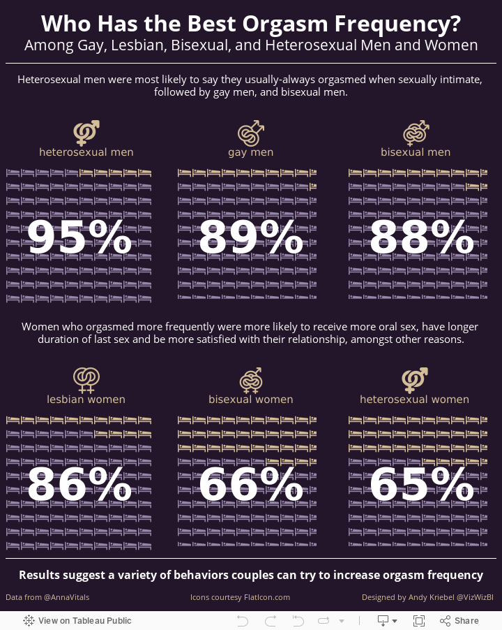
Makeover Monday: Who Has the Best Orgasm Frequency?
Let's take a quick look at the original viz by Anna Vital, an information designer based in San Francisco.
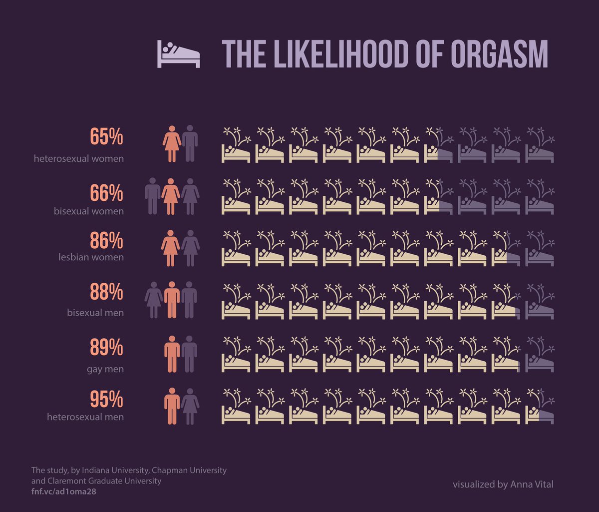
- Orange text on the dark purple background
- Title captures your attention
- Using icons for the relationship type
- Nice big numbers
- Bed icon that looks like it has shooting stars coming out of it
- Metrics are sorted
- Including references to the data source
- Simple, organized layout
- Bed icons are partially shaded, which makes it tough to know the exact amount each bed is shaded. However, including the large numbers helps offset this weakness.
- Light purple is really hard to read
- Could use a better title; this one captures our attention because it's about sex
- Should the icons that are shaded as out of the range still have the fireworks coming out of them?
- Sorting from worst to best; I would sort the other way around to emphasize the positive
June 19, 2016
Makeover Monday: Theft in Japan

This past week felt like such a great week for learning and I feel fortunate that I have Makeover Monday to apply those learnings. There are two influences in particular I’d like to call out:
- Rob Radburn gave an amazing presentation about Makeover Monday at TC London. In his presentation he referenced the book “Steal Like an Artist” which I’ve read before. But then Rob went through several examples where he pointed out where he stole like an artist.
- The Data School gave presentations this week that focused on infographics. You can watch their presentations on YouTube here. I was totally blown away by their work and wanted to create one of my own this week.
Before we look at my viz, let’s have a quick look back at the original from Nippon.com.

What works well?
- The data is organized by the theft type, using color to distinguish the groups.
- The total number of thefts is included for context.
- Each outer ring is sorted properly, with “Other” being ranked last.
What doesn’t work well?
- A donut inside a donut is NEVER a good idea.
- Labeling every single slice makes the chart overwhelming and too busy.
- The theft types (inner donut) are in reverse order.
- The colors are ok, but not particularly outstanding.
- Making comparisons is very difficult.
As I mentioned, this week I wanted to create an infographic. Like Rob suggested, I did a quick Google search for inspiration and this identity theft chart from PC Magazine struck me for its colors and organization. Without further ado, here’s my Makeover Monday infographic.
I created this in Tableau 10; if you’d like to download it, you can do so here.
March 23, 2016
Dear Data Two | Week 47: Smells

Let’s get straight to the point…London, you stink! Between your smokers, your trash, and your stinky commuters you need to slap on some deodorant!
For week 47, I tracked every smell or scent that I really noticed. Clearly other London smells really bad or I only notice the bad smells. How can only 1/3 of the things I smell be positive? Really, I think it’s that there are so many smokers that sets me off.
On the positive side, 85% of the food I smelled was nice. But dang, that stinky fish someone was cooking in the office was god awful. Why would someone microwave salmon? So gross! I went down to Brighton for a half marathon over the weekend and, not surprisingly, I really enjoyed the smell of the sea, the fresh air, the not-so-polluted part of England.
For inspiration this week, I looked at Giorgia’s postcard.

Her shapes reminded me of noses, so I found a nose icon and created a panel chart view, which I think turned out quite nice. This was definitely what I wanted to take over to the postcard, yet there was no way I had the talent to draw 45 noses. Off I went to the stationery store to look for a stencil. I couldn’t find a nose stencil, but I did find a cool 3D stencil. So I created 3D ovals and added a bunch of other information for context.
Fortunately Jeff isn’t colourblind, so I stuck with a red/green palette to signify good vs. bad smells. Flip through the story points below to see how my week turned out.
September 27, 2015
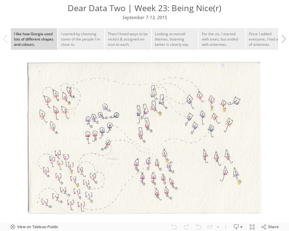
Dear Data Two | Week 23: Being Nice(r)

My initial thought was to do a word analysis for Tweets and emails, but that didn’t interest me much. I considered tracking every time I said something nice to someone, but that would be a data collection nightmare.
Instead, I settled on a simple list of some of the people I’m closest to and ways that I can be nicer to them. I borrowed heavily from Giorgia’s categorisation. From there I thought I would create tree-like structures for each person, but when I sent a sample to Jeffrey, his first comment was:
Wow. This looks really awesome. Antenna charts.So deflated! But drawing the trees meant adding a lot of rows to the dataset…maybe this was a blessing in disguise. I decided to go with the antenna charts idea and straightened out the branches. The Tableau part was pretty simple, since it’s really just a game of “connect the dots”. The tough part was transforming this onto a postcard given my limited drawing skills.
September 1, 2015
Dear Data Two | Week 13: Desires

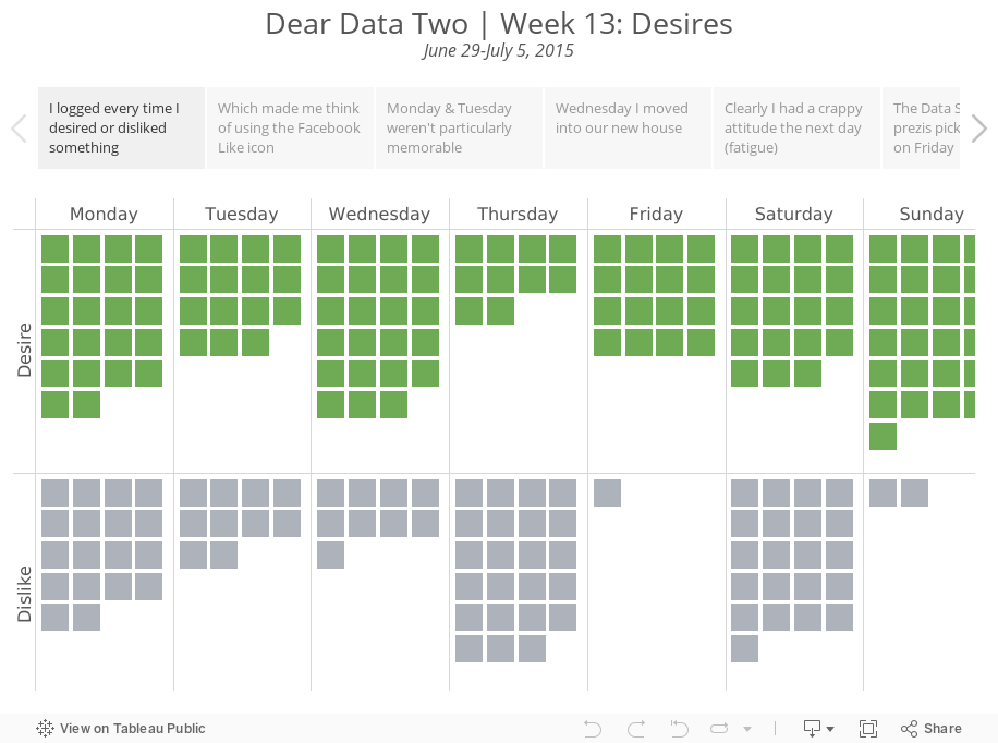
In Tableau, a unit chart seemed to make the most sense for visualising the frequency. I then thought about the Facebook "Like" icon and decided to switch to using that symbol as the unit chart. A simple square communicates much more effectively and it much easier to count quickly.