September 1, 2015
Dear Data Two | Week 13: Desires
attitude
,
Dear Data Two
,
desires
,
dislikes
,
icon
,
likes
,
unit chart
2 comments

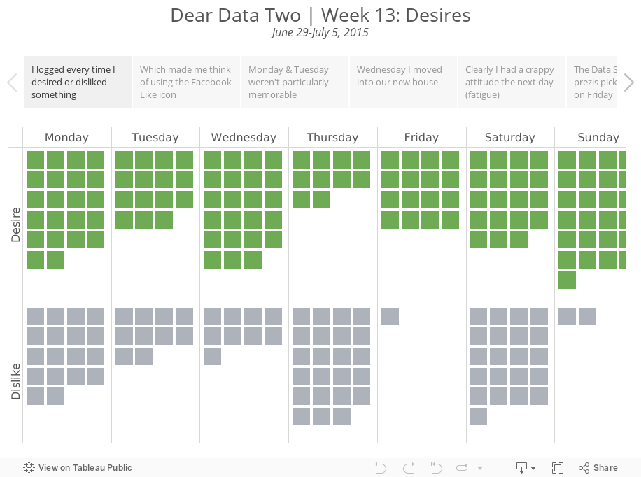
Only a couple more weeks to catch up on. Today I got back to week 13, when I tracked desires and dislikes. To track desires, I logged every time I thought about things like: desires, wishes, cravings, requests, asking for, urges, etc. For dislikes, I logged things like: dislikes, loathes, disgusts, aversions, hates, etc.
In Tableau, a unit chart seemed to make the most sense for visualising the frequency. I then thought about the Facebook "Like" icon and decided to switch to using that symbol as the unit chart. A simple square communicates much more effectively and it much easier to count quickly.
In Tableau, a unit chart seemed to make the most sense for visualising the frequency. I then thought about the Facebook "Like" icon and decided to switch to using that symbol as the unit chart. A simple square communicates much more effectively and it much easier to count quickly.
Subscribe to:
Post Comments
(
Atom
)


Hi,
ReplyDeleteI'm working with this Tableau workbook and I can't see what setting is used for creating a square for each line of data in the 'Squares' worksheet. In my worksheet, I just get one square in Sun - Sat for Desire and Dislike.
Any suggestions? Thanks
There are more squares because I turned off aggregation on the Analysis menu.
Delete