September 1, 2015
Tableau Tip Tuesday: How to Show KPIs & Sparklines in the Same Graph
KPI
,
LOD calc
,
sparklines
,
table calculation
,
tableau
,
tip
,
Tuesday
15 comments

One of my favorite tricks is to create table calculations and make them discrete for showing in the rows and columns. This frees you up to use the other chart types alongside a table.
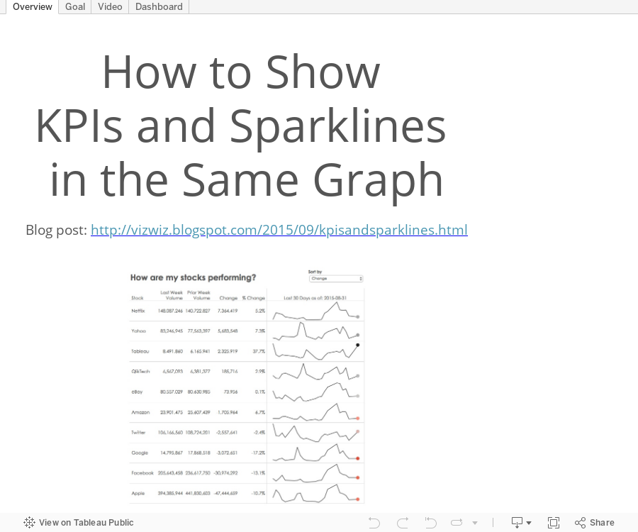
Back in November, I wrote step-by-step instructions for combining KPIs and sparklines into the same worksheet. With Tableau 9, things have changed a bit in that these are now even easier to create with LOD calcs. In this video tip, I show you how to create these views. Use these and you'll never think about Tableau's lack of synchronous scrolling again.
Back in November, I wrote step-by-step instructions for combining KPIs and sparklines into the same worksheet. With Tableau 9, things have changed a bit in that these are now even easier to create with LOD calcs. In this video tip, I show you how to create these views. Use these and you'll never think about Tableau's lack of synchronous scrolling again.
Subscribe to:
Post Comments
(
Atom
)


Andy, I can't open the download in Tableau 9.0.3. What version did you use?
ReplyDelete9.1 which was release last night so you can upgrade to it.
Deleteinstead of using datediff('day',date, maxdate)<6 why are you using attr(date) and total(maxdate)
ReplyDeleteHi Andy, I found this tutorial very interesting! I'm trying to have same trend but instead of Volume I have SLA% (percentage) and this field is an aggregated field. Would I be able to use Window_sum here or this only applies for Volumes? My other alternative is to simply create different sheets and merge them into dashboard but I really love your method. Thanks!
ReplyDeleteDan, you can use an aggregate inside a table calc. The difference is that since your field is already aggregated, you wouldn't include sum or avg inside the window calc. You'll use your field instead.
DeleteThanks Andy! Still no luck so far, I've tried to add the AGG SLA% last 7 days to Rows but I get multiple rows created inside Category. If I add a table calculation to AGG SLA%, I'm forced to select SUM/ AVG/ MAX etc and this won't work with this weighted average. I'll keep trying, I think I'm very close and don't want to give up yet :)
DeleteHey Dan, I am having the same problem. Were you able to find a solution?
DeleteIf all records don't share the same max date, then the Last Day logic doesn't work. How do you propose to address this? I've tried a couple things without success. BTW, great update to this concept.
ReplyDeleteYou can use an LOD calc to get the max date at the level you need.
DeleteHi Andy I tried using {FIXED[Product Name]:MAX([Order Date])} but I am still not getting the last day logic to work. If you have any other solutions please let me know. Thank you!!
Delete{FIXED [Product Name] : MAX([Order Date])} works for me if I'm looking for the max date for each product name.
DeleteThis is awesome! Is there a way to color code the % change also? I'm playing around with Jonathan Drummey's conditional formatting workbook but can't seem to combine the sparkline (using date) and his method for independently formatting a column. Do you know a way?
ReplyDeleteHi Jay. In this case, the % change is discrete so you can't color code it. Have you seen my tip from this week where I use an ascii circle to show alerts? That's even better I think.
DeleteThanks Andy, is it possible to add top 5/10 feature to this chart?
ReplyDeleteOf course it's possible. Give it a go.
Delete