April 3, 2017
Makeover Monday: Which UK workers are most at risk of being replaced by robots?
automation
,
difference
,
gantt
,
gap
,
jobs
,
Makeover Monday
,
united kingdom
3 comments
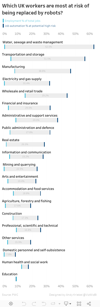
This week, she chose this viz from The Guardian about the jobs that are most likely to be replaced by automation:

What works well?
- The overall design is super simple to understand.
- The gaps are evident by using distinct colors for the two categories.
- Including references to the data source
- Clean fonts
- Grey background bars help make the blue lines pop
- Axis labels only include the % sign on zero
- Sorting is easy to understand even though it isn't stated
- Long scrolling view suits this design
What could be improved?
- Grey background bars don't need to extend the entire width. They would help accentuate the difference if they only extended between the two blue bars.
- Why are some of the jobs in bold?
- The title is way too long.
- Is there a better way to make the gap easier to interpret?
Since I really like the design of this visualisation, I decided to try to recreate it while also including the things that I would like to see improved. I'm going to post this as a future Workout Wednesday, so if you participate in that project, hold off on downloading this workbook to see how I made it.
Another fun week. I learned a bunch creating this viz and it was easy to keep all the work under an hour.
Subscribe to:
Post Comments
(
Atom
)


ReplyDeleteI'm honestly struggling to clearly interpret this plot as it is:
does it show that, say, 46.4% of all jobs in manufacturing are at high risk of being replaced, but in total people employed in manufacturing are only 7.6% of all employed everywhere?
wouldn't scatter plot work better here -- with percent of total employed population and percent of jobs under high risk as two axis?
That's the way I interpret the meaning Eugene. As for scatterplots, check out the weekly Makeover Monday recap. You'll see a couple good scatterplots there.
DeleteThanks Andy, I had a look and quite a few excellent ideas there.
Deleteand thanks for running all those blogs,btw - always interesting and useful.