March 4, 2019
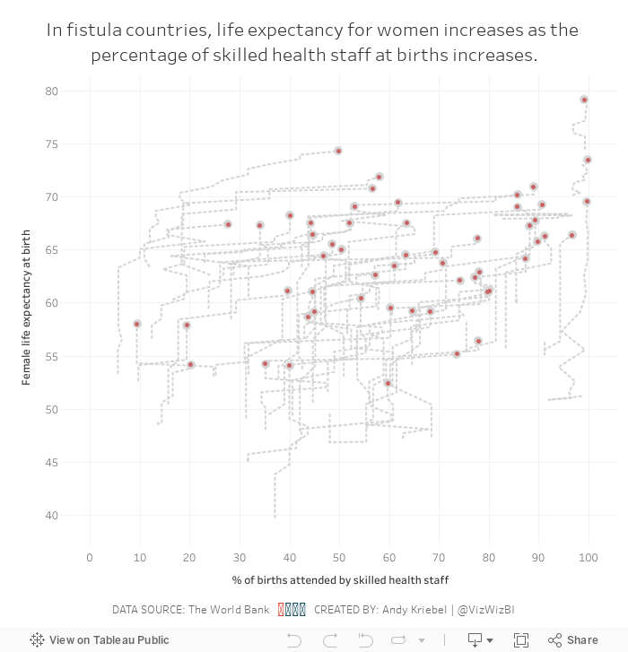
Makeover Monday: Are skilled health staff an indicator of female life expectancy in fistula countries?


What work well?
- Using a continuous color palette
- There are no exceptionally large countries compared to the others, so a filled map is a good choice.
- Normalizing the data to make comparisons across countries more relevant.
- Using grey for countries with no data.
- Good title and subtitle
What could be improved?
- If there is data across years, it would provide additional context to the data. In other words, is the situation improving?
- Make the title bigger; it's too small compared to the large map.
My Goals
- Compared the metrics between fistula and non-fistula countries
- Look at change over time
- Figure out how to deal with all of the nulls
- Be done
Subscribe to:
Post Comments
(
Atom
)


No comments
Post a Comment